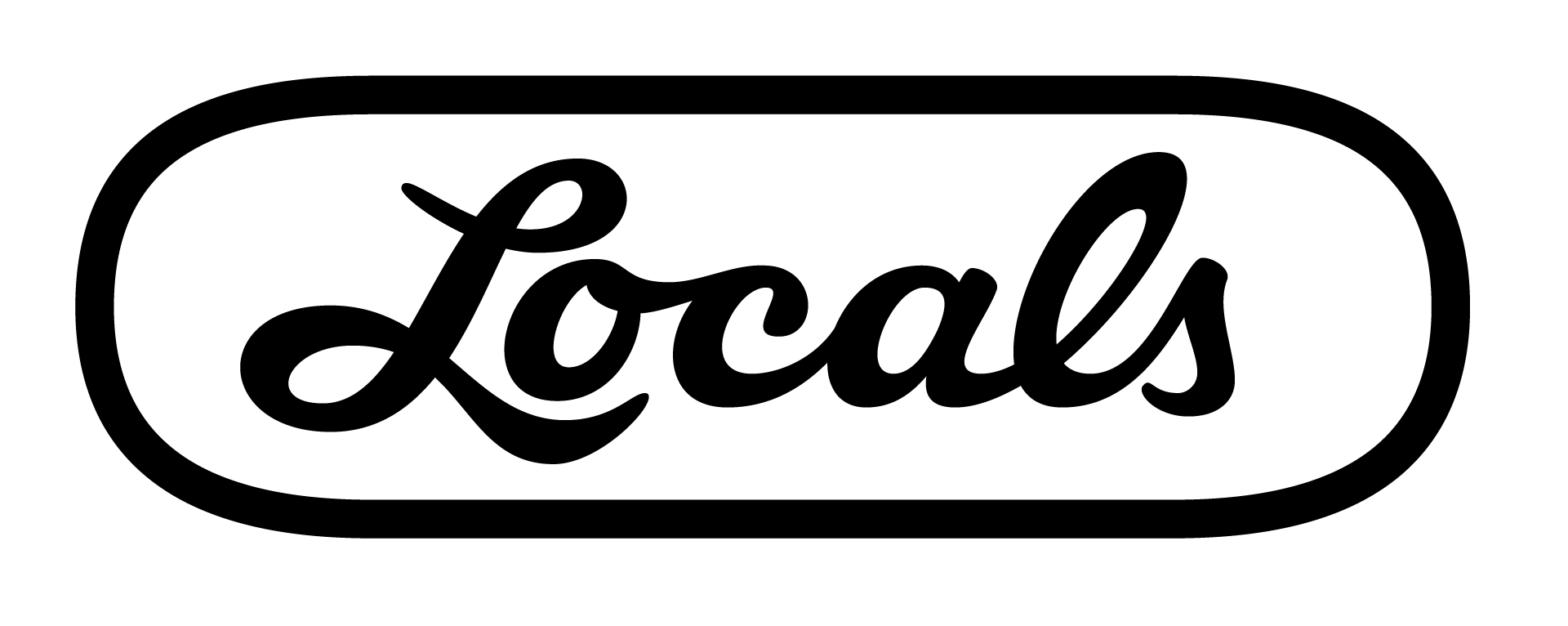
Locals is a ubiquitious slippah brand in Hawaii. To the point where I almost feel silly writing it out. The brand was established in 1978 and you can find their wordmark printed on the strap of this classic footware.
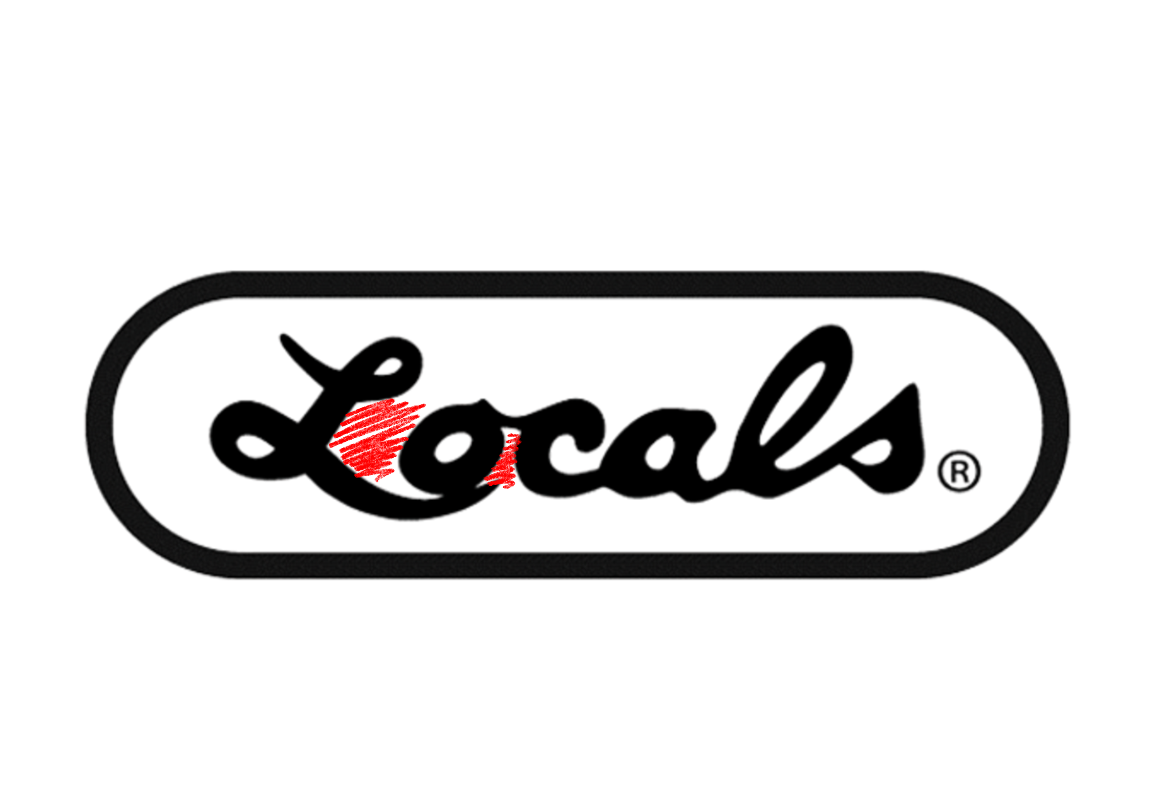
Taking a closer look at the logo and the lettering, we can highlight a few weak points in the mark that will make a starting point for some quick yet effective improvements. We want our letters to have a more consistent slant, better spacing between the letters, specifically the L and o, a consistent weight between thick/thins, and a clean up of the overlapping strokes.
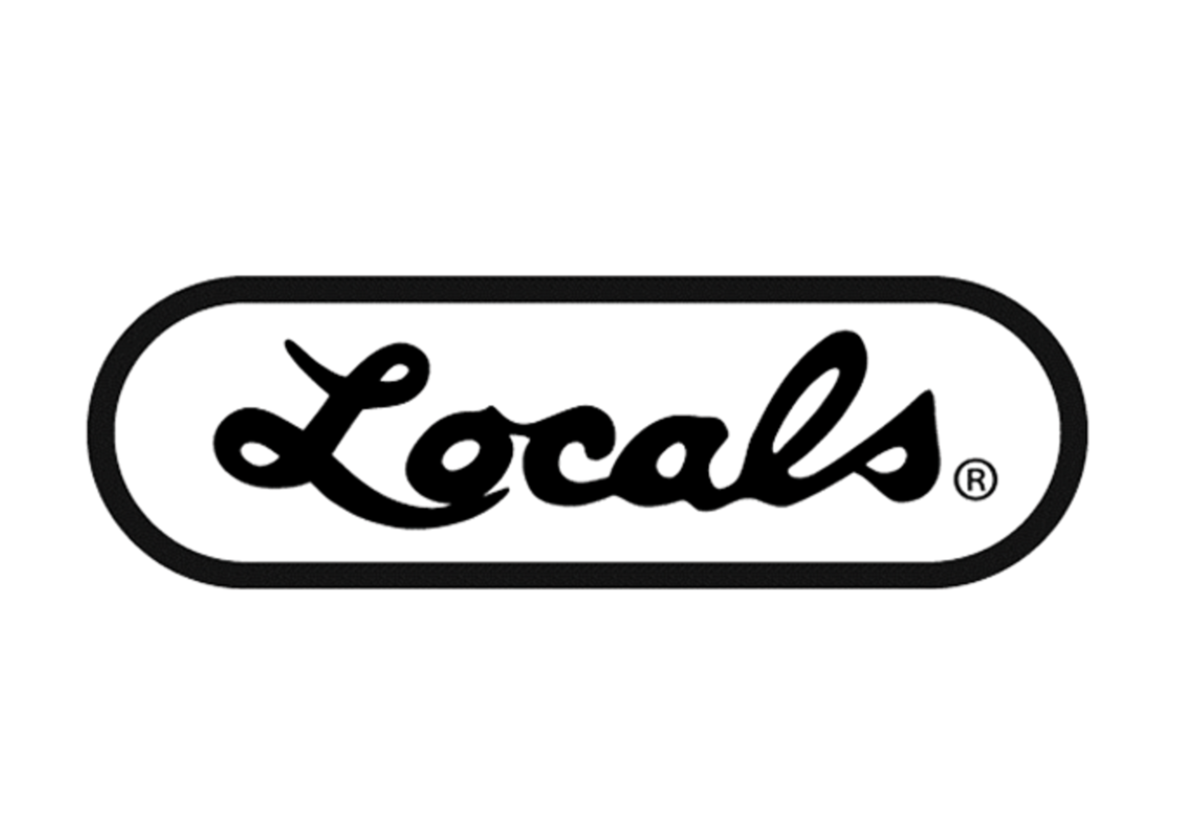
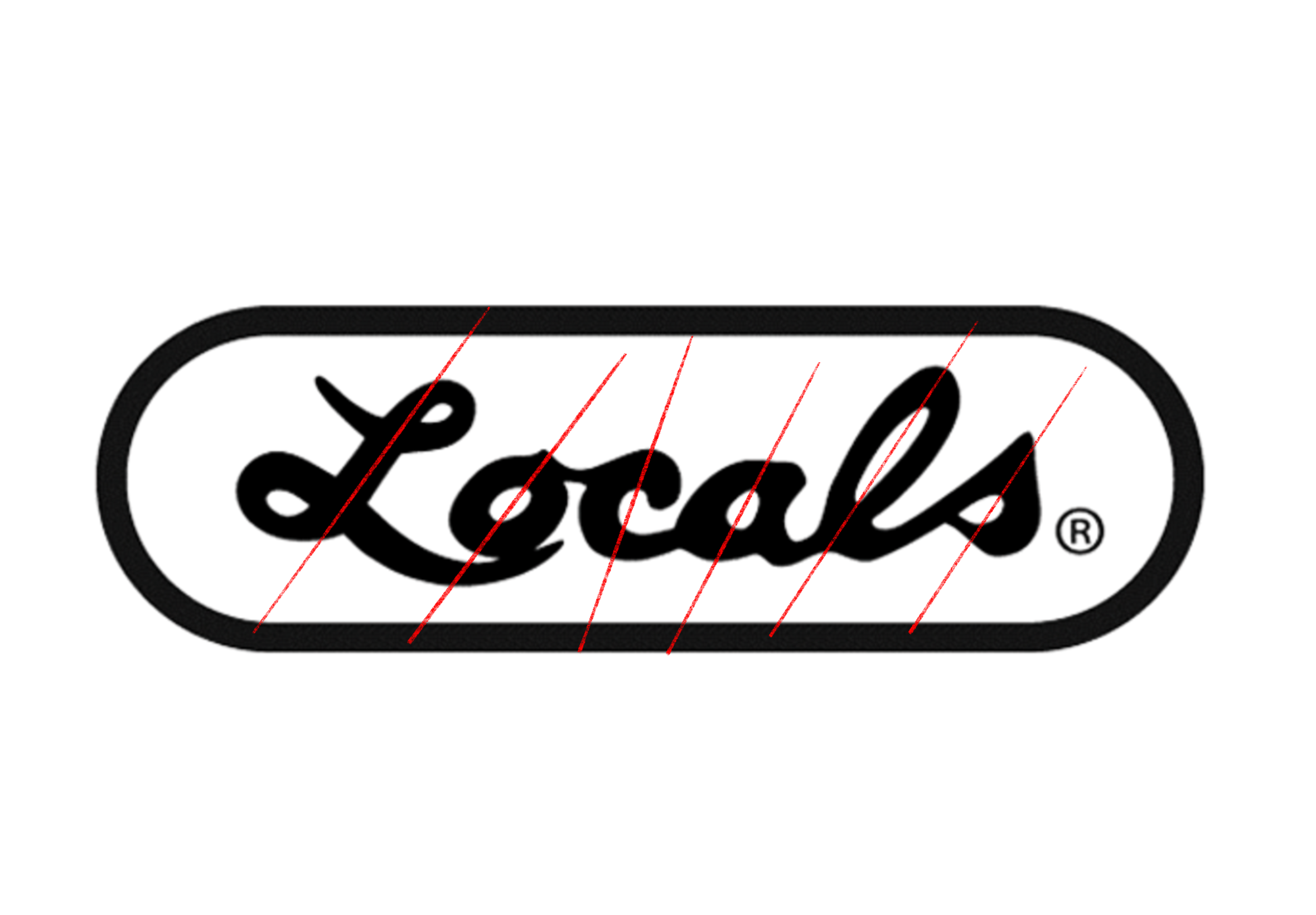
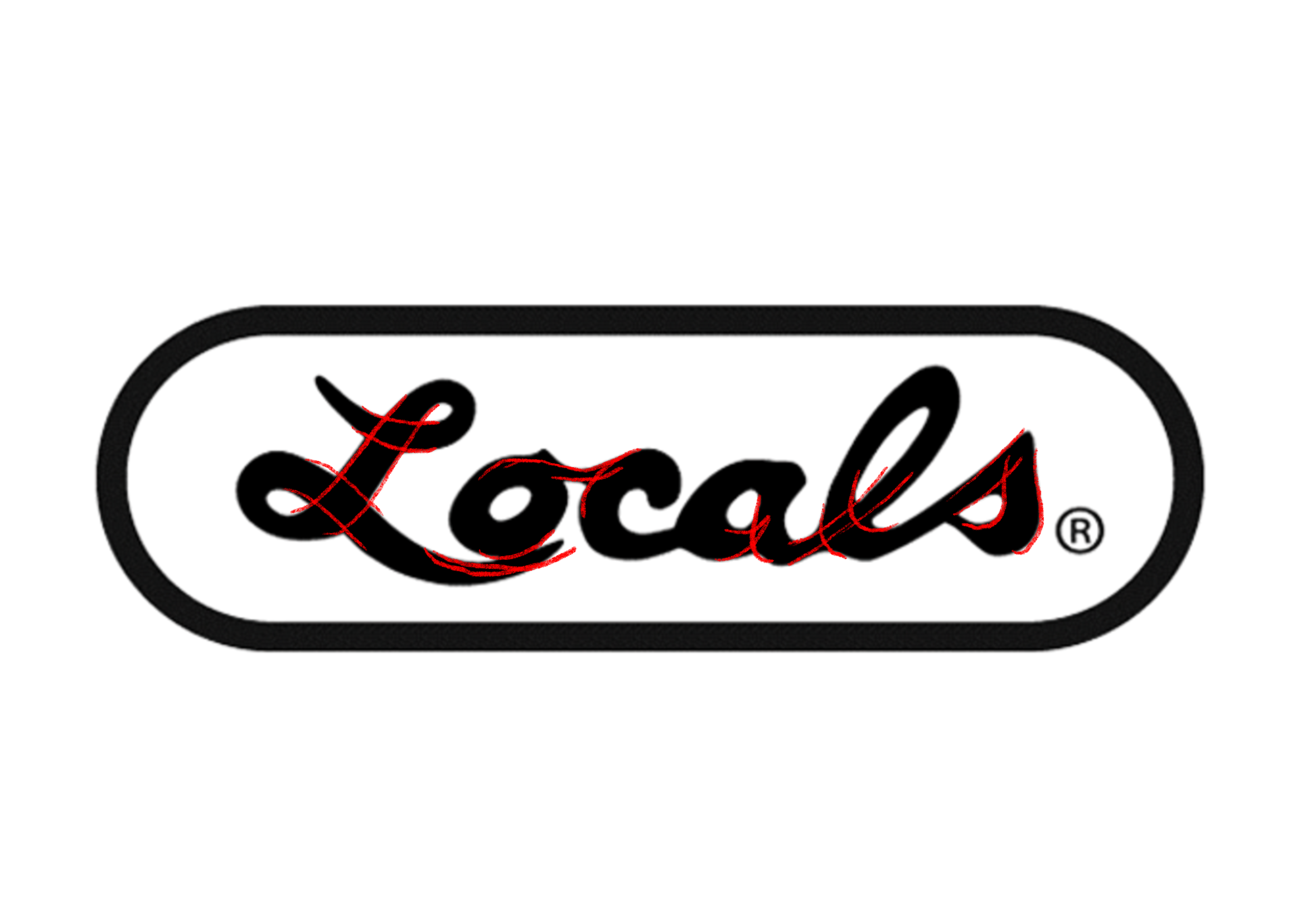
With stroke overlaps a good rule of thumb is thick strokes never overlap thick. When deciding where overlaps round, go back to the way the stroke is drawn. In the original you can see the als especially lose some definition in their shape.
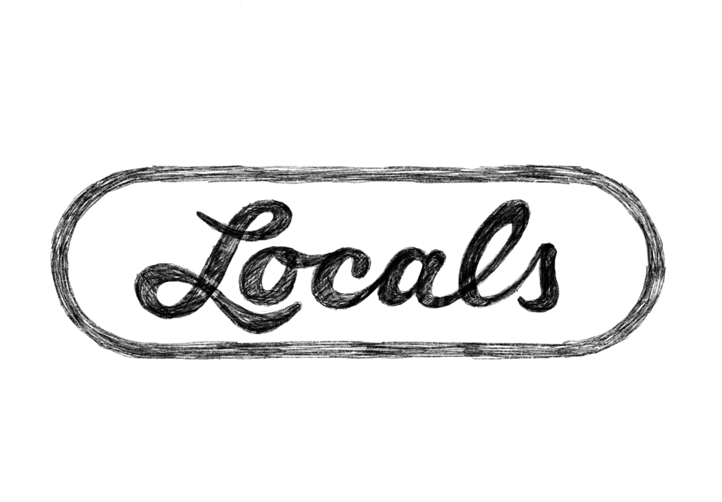
I find it's easier and quicker to sketch out these shifts. This way I can explore a few varieties and shapes quickly without getting bogged into vector wrestling. In the sketch below I've fixed the slant and cleared up the connecting strokes so that each letter reads a bit better. I am a big fan of the way the L wraps around the o. Now it no longer collides but simply echos the shape with a nice lead into the wordmark.
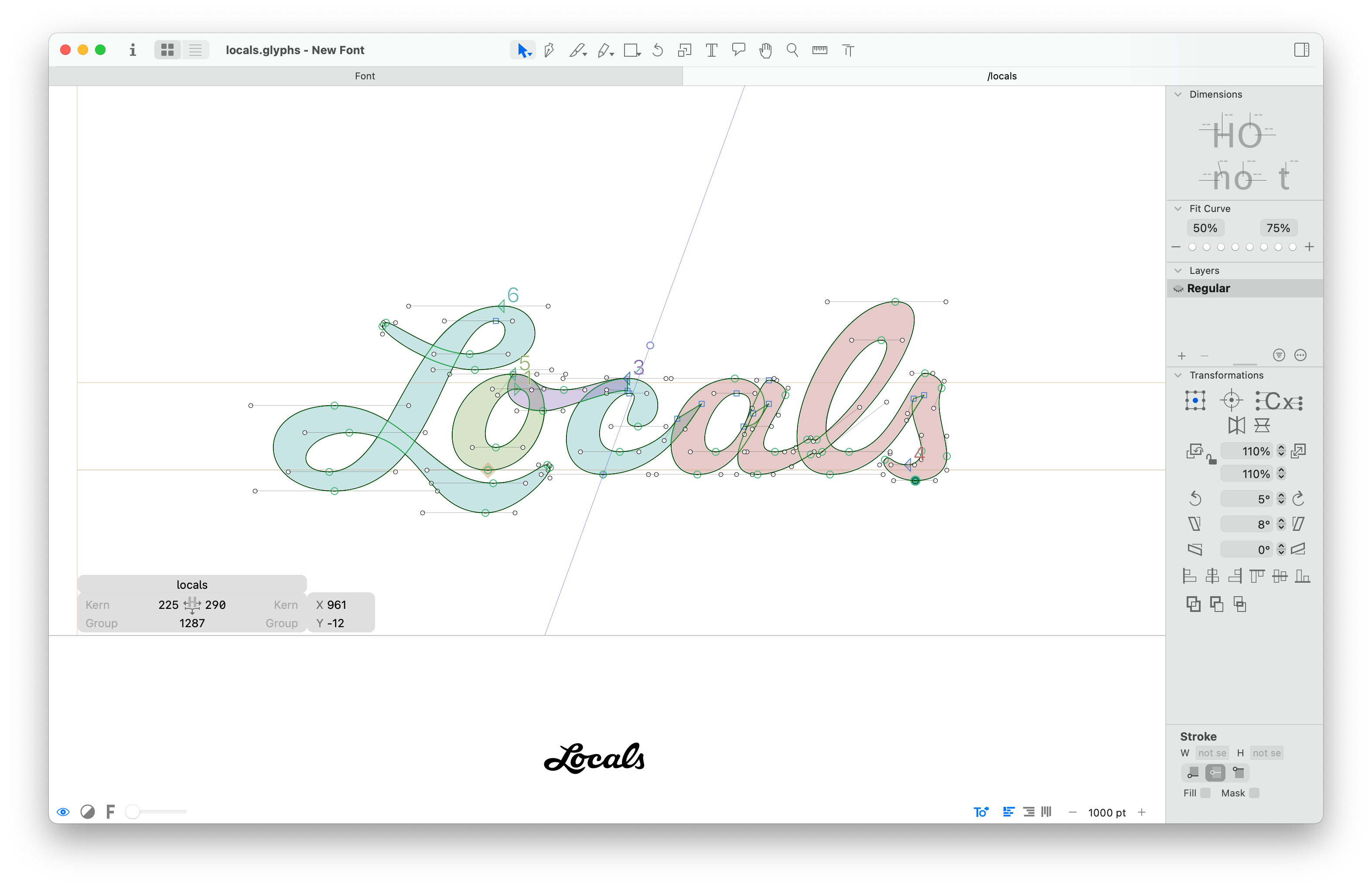
Once I'm happy with the forms I can take it into vector form and give it another once over. At this point its more than just tracing what I've drawn, but really looking at the shapes and making sure this are a consistent weight with some nice curves. One little tidbit that I find interesting is the crossover on the lowercase l. If that line literally crossed straight across it appears to shoot out a little too high. It's called the Poggendorff illusion and it's an easy fix once you know what to look for.
This logo refresh isn't a huge overhaul of the brand, but just some specific, effective tweaks that help the logo read better at small sizes and present a more crisp representation of the Locals brand.