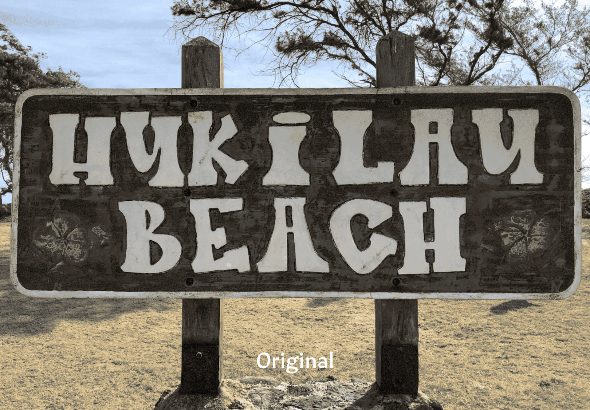
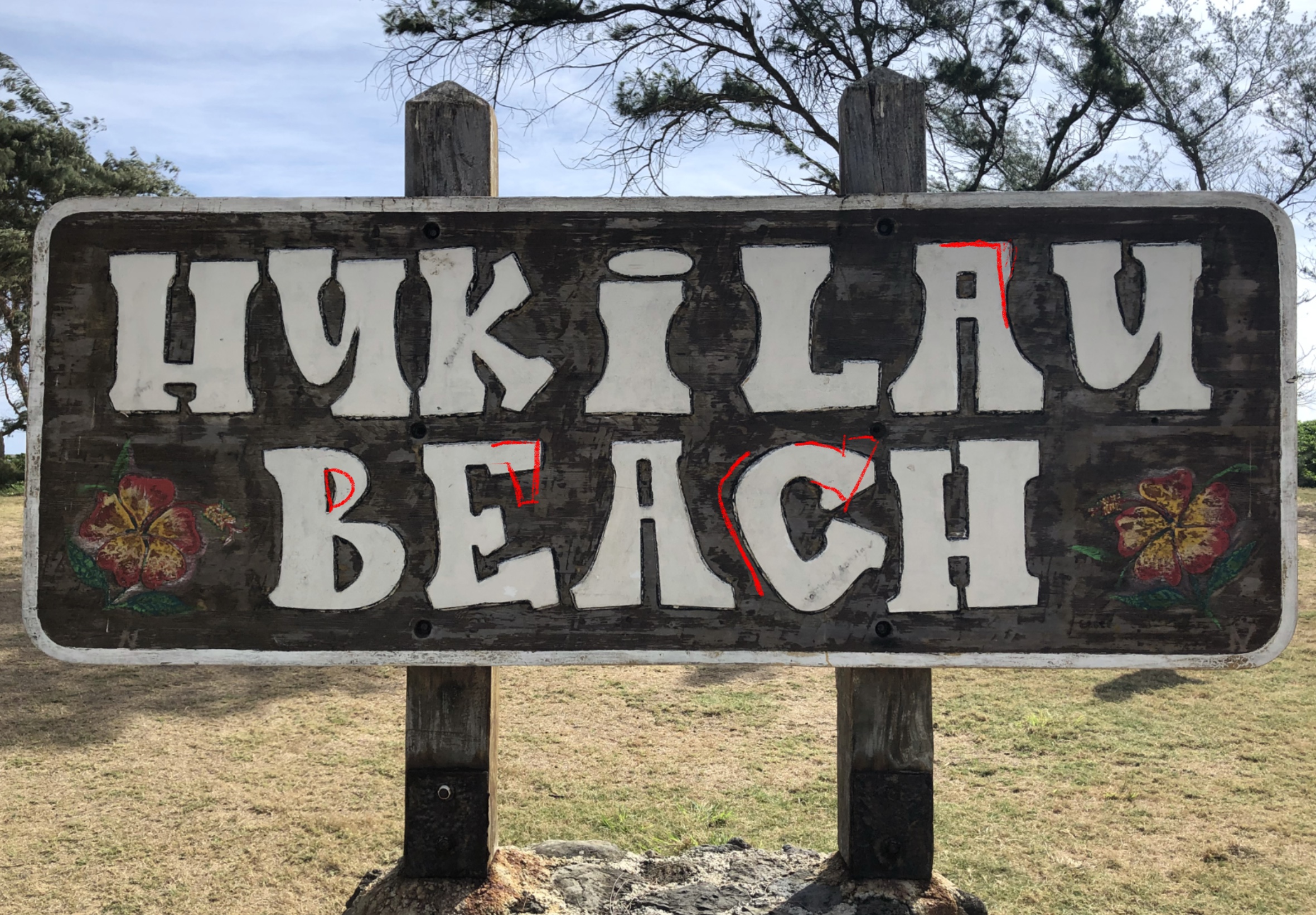
Rarely can you go to Hukilau without seeing someone you know from the community there. I mean how many beaches do you know that have their own song? The sign at the entrance of the beach park has a lot of good things going for it.
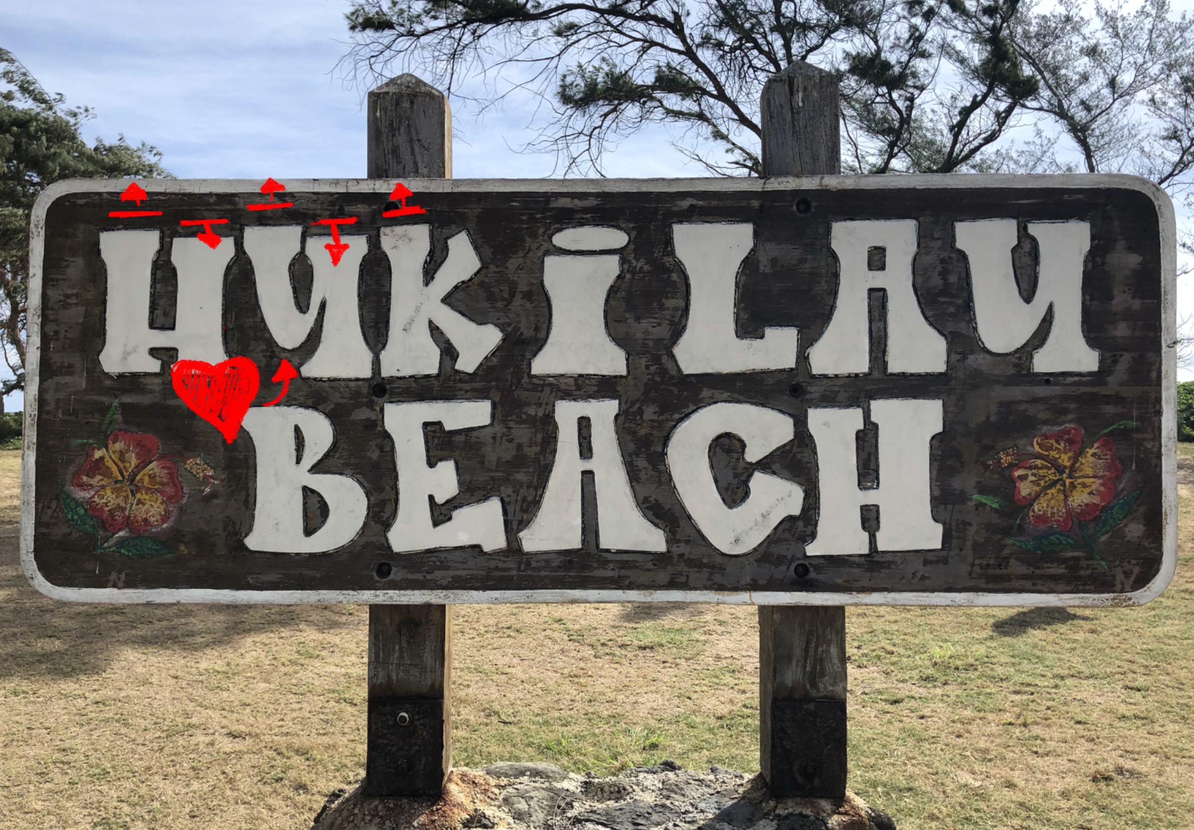
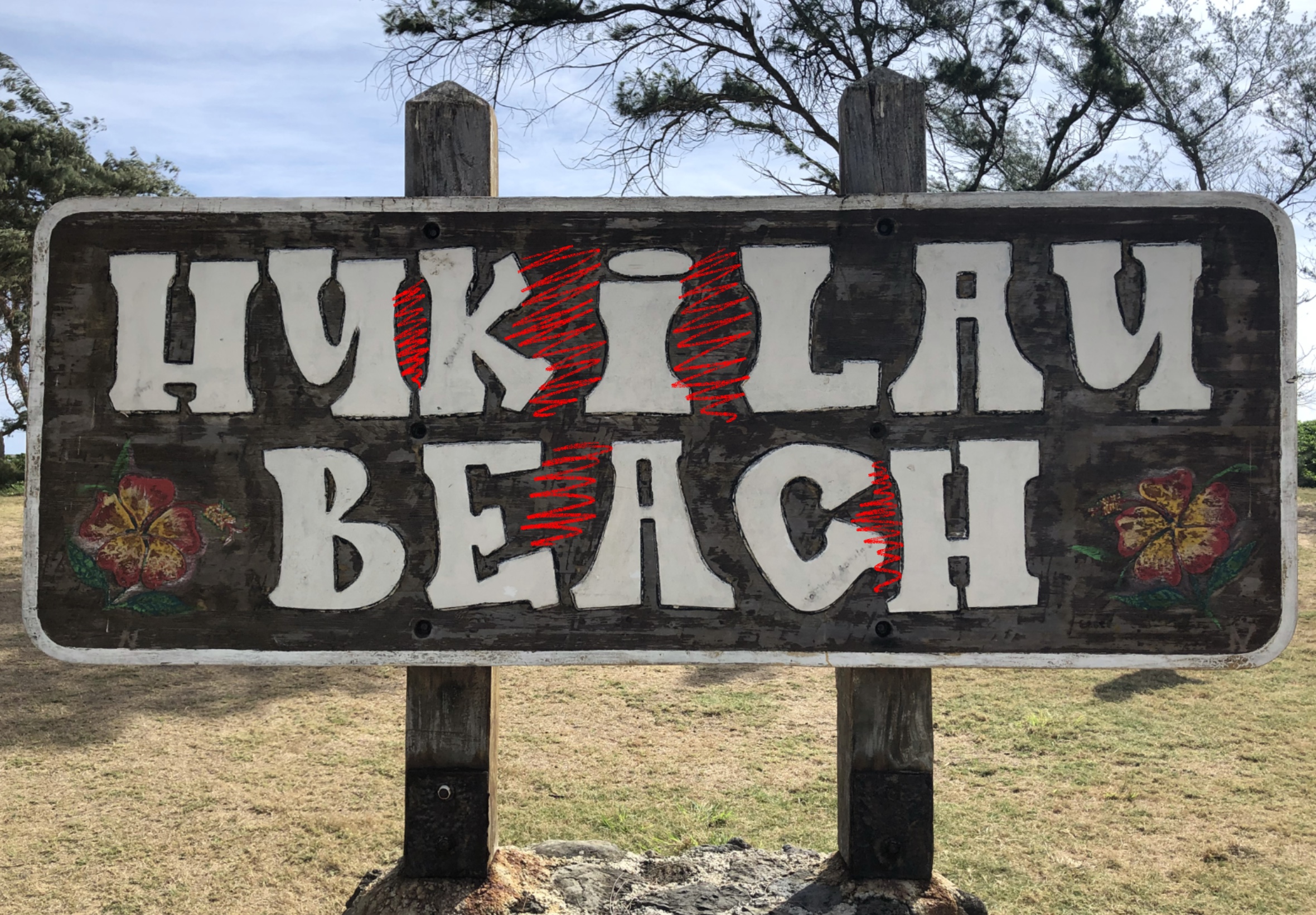
Taking a closer look at the lettering, a few things pop out to me as classic Hukilau. These are things that I can't get rid of without wrecking what makes this such a memorable piece of lettering. I love the bell-bottom slab serifs with the odd waistline, the bouncy baseline and letterforms, and the very distinctive u shapes. There's plenty of room for improvement, letter spacing can use some work. I want to equalize the space between letters so it reads as HUKILAU rather than HUK I LAU. Some of the letter forms have serifs growing where they shouldn't and other serifs trimmed short where they could instead show off. The weird shape of the c I can attribute to how difficult it must be to carve a nice curve by hand. But we can fix it.
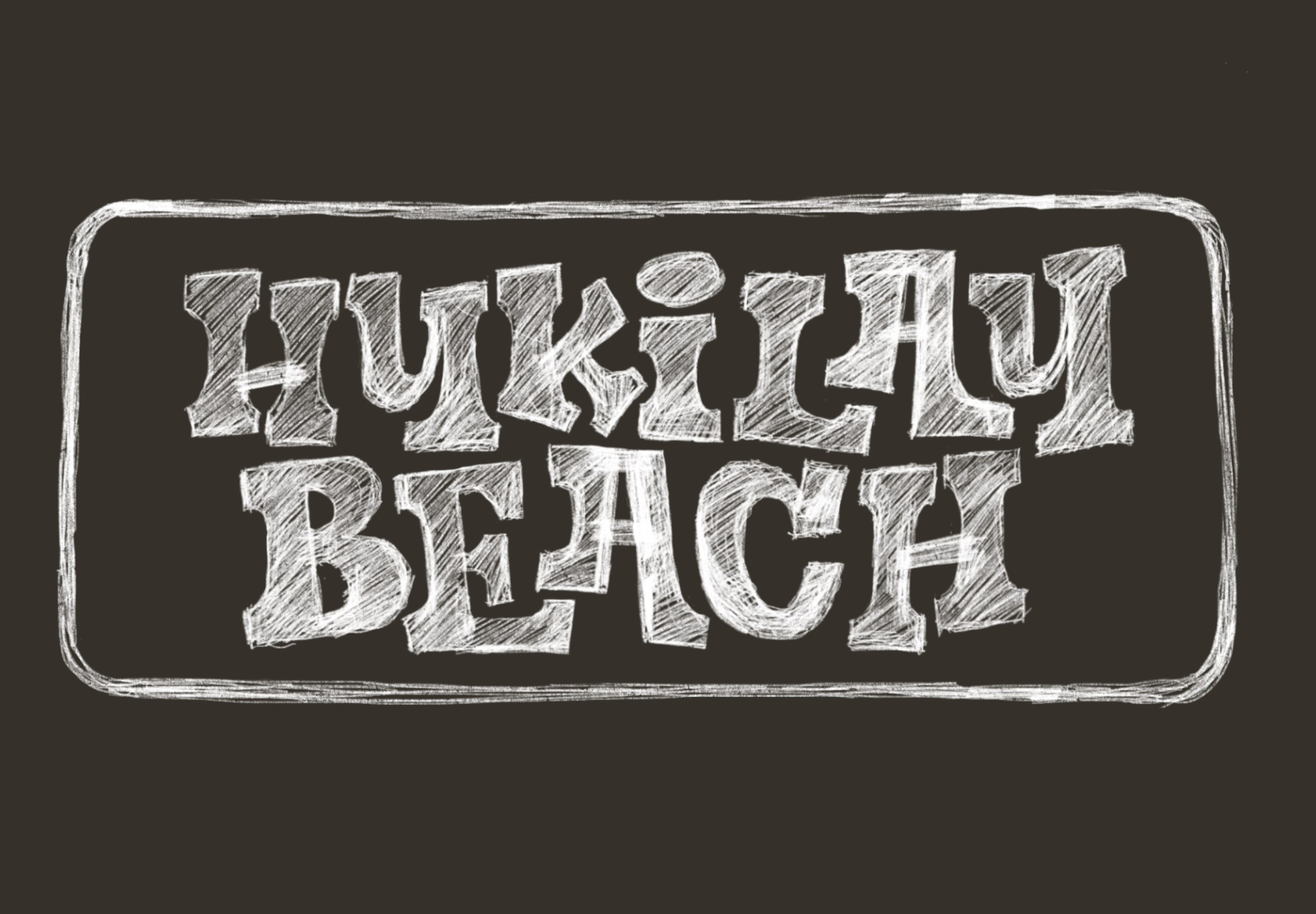
I find it's easier and quicker to sketch out these shifts. This way I can explore a few varieties and shapes quickly without just tweaking verctor paths back and forth. Letters at their core are hand-made marks, the best way to keep life in the letters and find a natural shape are to explore them by hand. Taking this sign into sketch form, I really worked out how to stretch and interlock some of the letters to help with the spacing and take advantage of that bouncing form. I am rather fond of the way the leg in the k fits into the i and the last u in Hukilau is propped up on the foot of the A.
With the main concept and goals worked out, it's time to take this into vector form. This lets me go over the idea with another pass, I can really look at letter widths and weight consistancy and get the spacing working just how I want. With this round of revisions I was fixed some of the letter heights and width issues that I missed in the sketch.
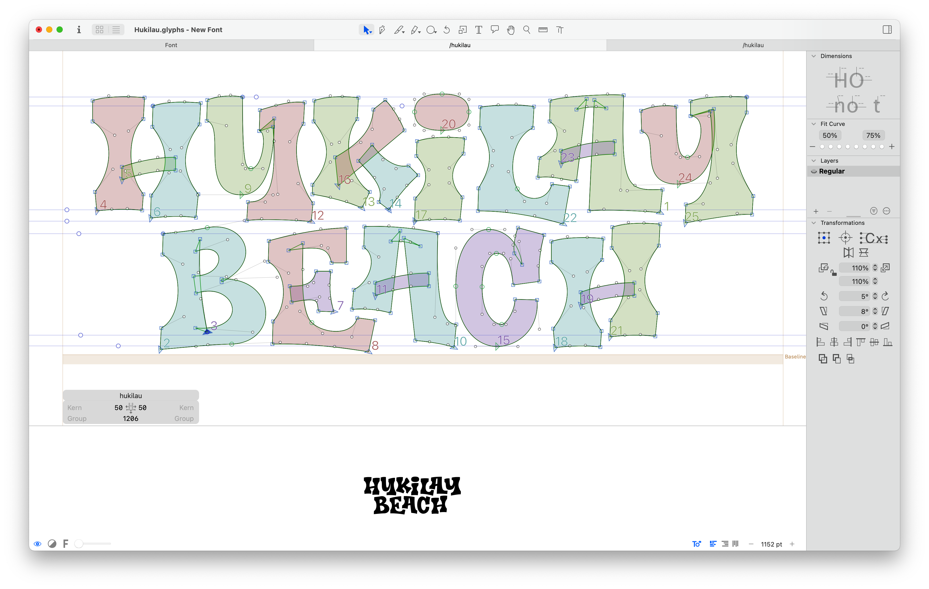
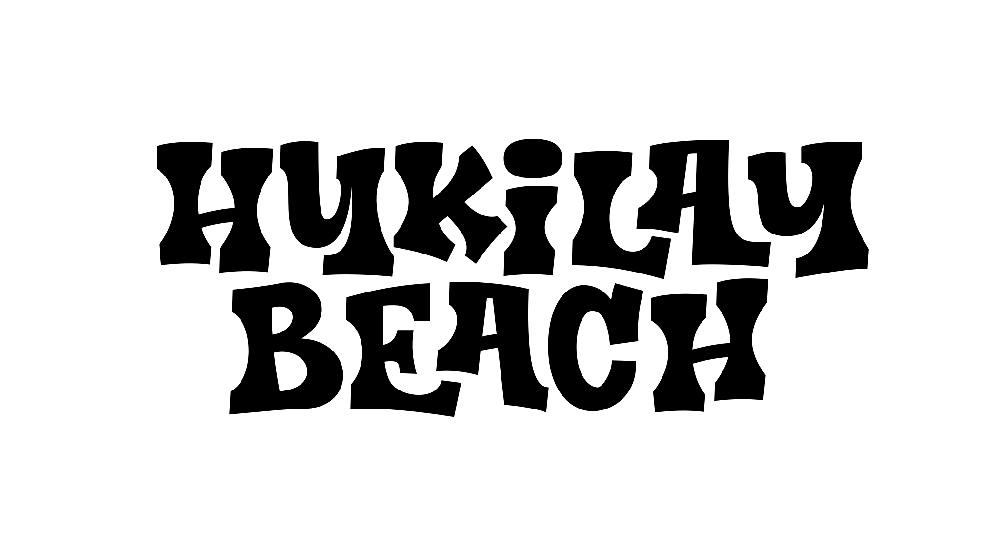
The new Hukilau Beach brand holds together with much improved letterspacing and a fun bounce. A good brand refresh doesn't strip away the good that the original brought to the table, but it emphasizes and improves on it. Really it just gets rid of the distracting elements to create a stronger piece of communication.