When I begin a self-initiated project, I like to take a few ideas, push them together, and follow the thread wherever it leads. As I was finishing the Type@Cooper Extended program, three goals shaped my next project. I wanted to design something rooted in my personal experience, I wanted the family to include a heavy black weight, and filtering through the Type@Cooper program, the typeface would follow a translation contrast model suited for body text.
These three aims converged in a font family I eventually named Pau Hana. At its core, Pau Hana is a type family with translation contrast, proportioned for continuous reading, but layered with influence from Waikīkī’s visual vernacular. In designing it, I wanted to see how local visual culture could be distilled and looped back as design inspiration. To help frame this mix of formal and cultural cues, I also looked to the spirit of Wes Wilson, whose poster lettering became a touchstone for approaching the heavier weights.
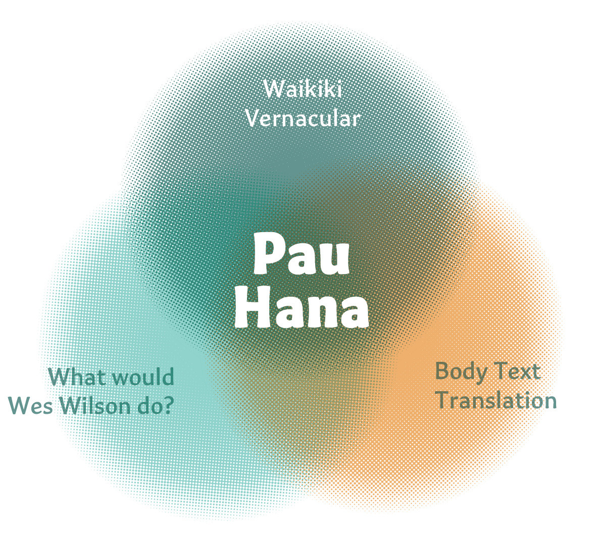
Waikiki Vernacular
I had been following the production process of Name Sans by ArrowType. It is a typeface that grew from the lettering of New York’s subway mosaics. The idea resonated with me: to look at the typography of your environment and treat it as raw material for design. For Pau Hana, that environment was Waikīkī.
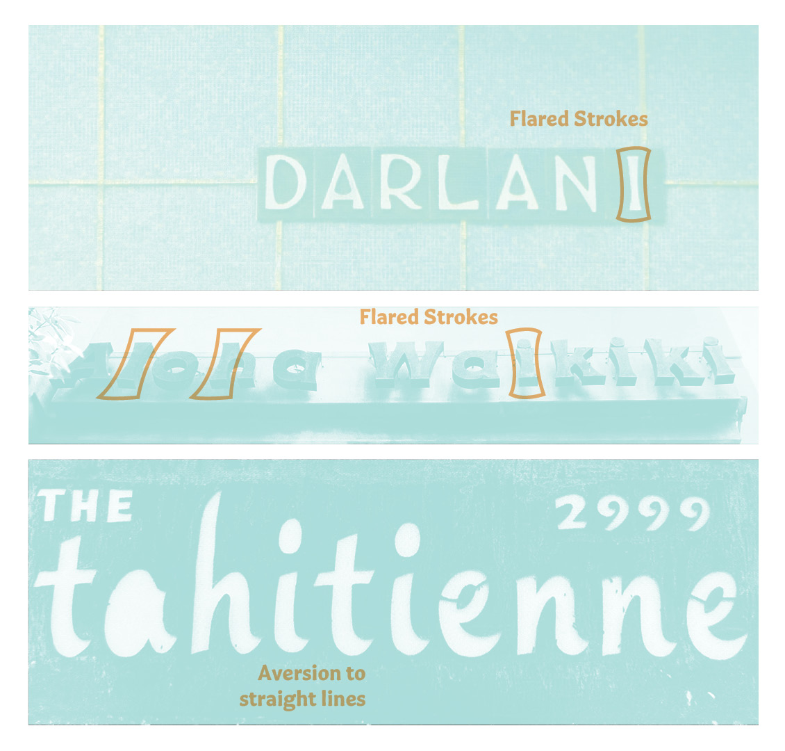
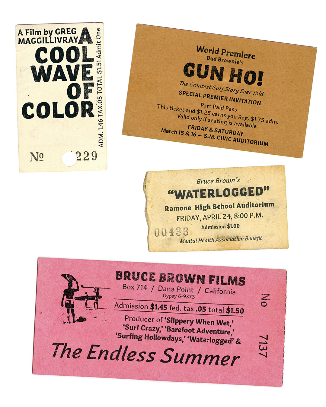
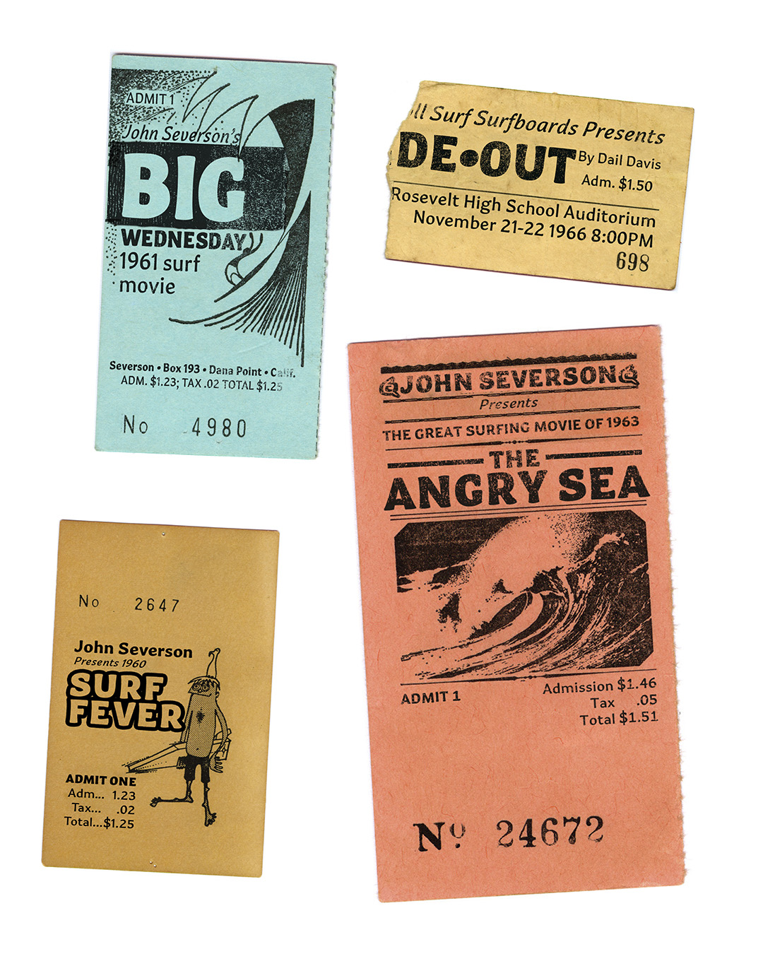
Waikīkī has its own lettering vernacular, shaped by decades of signage. Hawaii tourism left a residue of custom lettering everywhere. Each apartment complex, hotel, or business used a style popular of that time that leaned into flared strokes, and letterforms with an aversion to rigid straight lines. The result is a casual, dynamic tone that seems to capture the lure of the place itself.
I’d noticed a few of these signs on my own, but discovering the #signsofhawaii tag on Instagram revealed how widespread the aesthetic still was. Around the same time, I was gifted a copy of Mark Jonathan Davis’s Fonts in Paradise, which deepened my awareness of this distinct aesthetic. Both experiences sparked a habit of type-hunting every time I went through town.
Waikīkī’s growth took off after World War II, fueled by statehood and the accessibility of air travel. The boom years produced signage that matched the architecture and design trends of the time, developing in parallel with the rise of surf culture. Both drew from similar visual vocabularies, curves, flowing strokes, and relaxed geometry, and together they formed a lasting coastal aesthetic. As those styles evolved elsewhere, Waikīkī remained. Whether because the district was already built out or because nostalgia held sway, the mold was cast.
Over the decades, this aesthetic fed itself: new businesses echoing old signs, designers borrowing from a familiar visual language. That cycle of culture shaping form and form reinforcing culture is the feedback loop I wanted Pau Hana to join.
As I explored signage, I noticed a few consistent principles: emphasis on curves, flaring strokes, and energetic movement. These qualities became my guide for shaping Pau Hana’s forms.
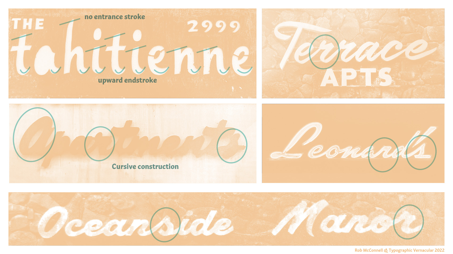
When it came to the italic, I turned back to Waikīkī signage. A sign for the tahitienne really stood out for me. It is an italic built without entrance strokes, instead relying on strong upward end strokes to create a good rhythm.
Most italics fall between a 4–14° slant, but the signs I studied leaned much further, often 24–36°. For Pau Hana I settled on an 18° slant: enough to reference the vernacular but still moderate enough for legibility in text. Structurally, the italic blends a single-stroke cursive feel with a few true cursive alternates built in as options. This gives Pau Hana a distinct italic while maintaining legibility.
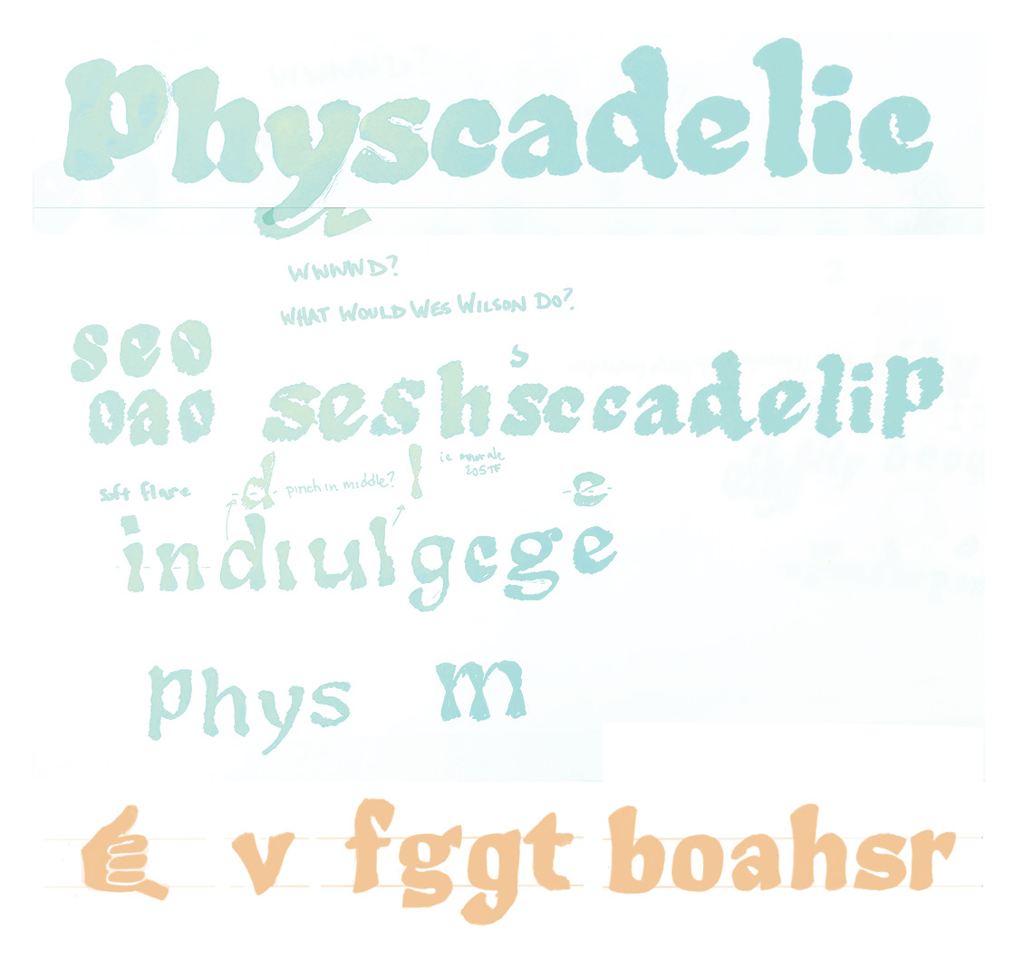
WWWWD?
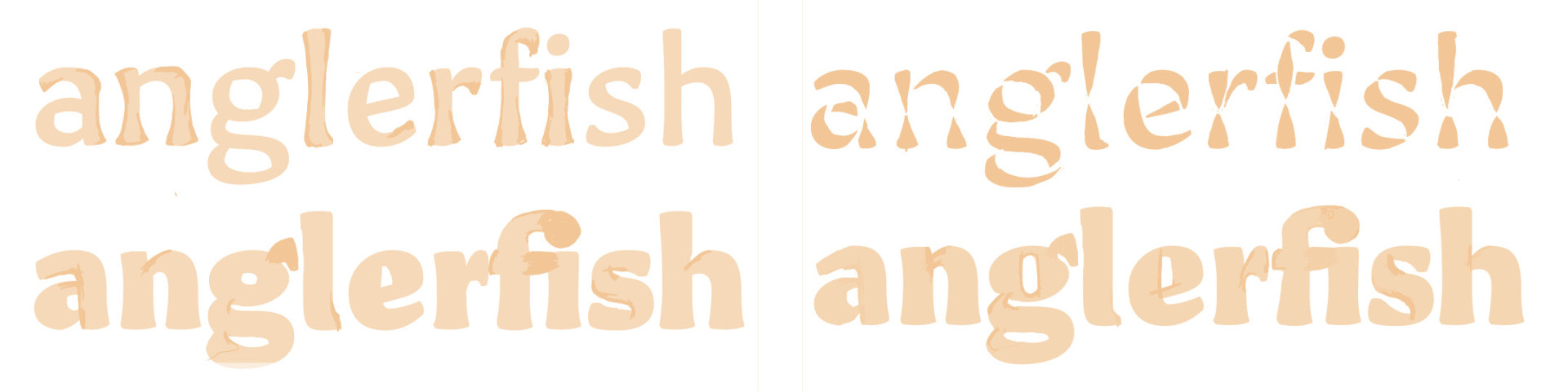
From the beginning I knew Pau Hana needed a heavy black weight. Once I committed to the idea of avoiding straight lines, I sought precedents that could embody that energy. No example felt more fitting than the poster lettering of Wes Wilson.
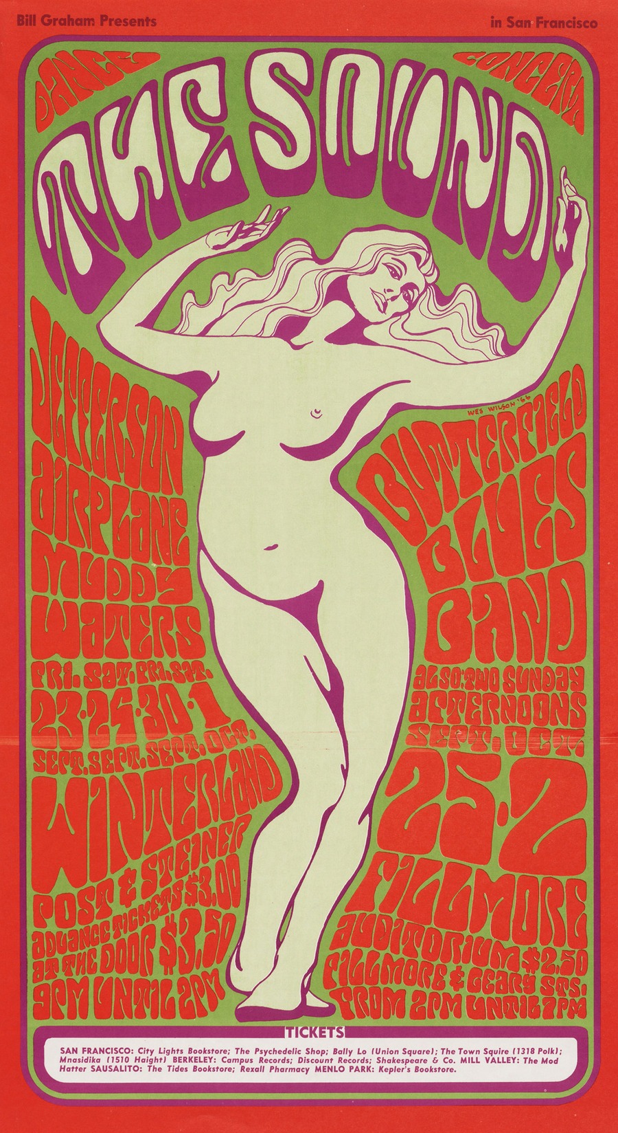
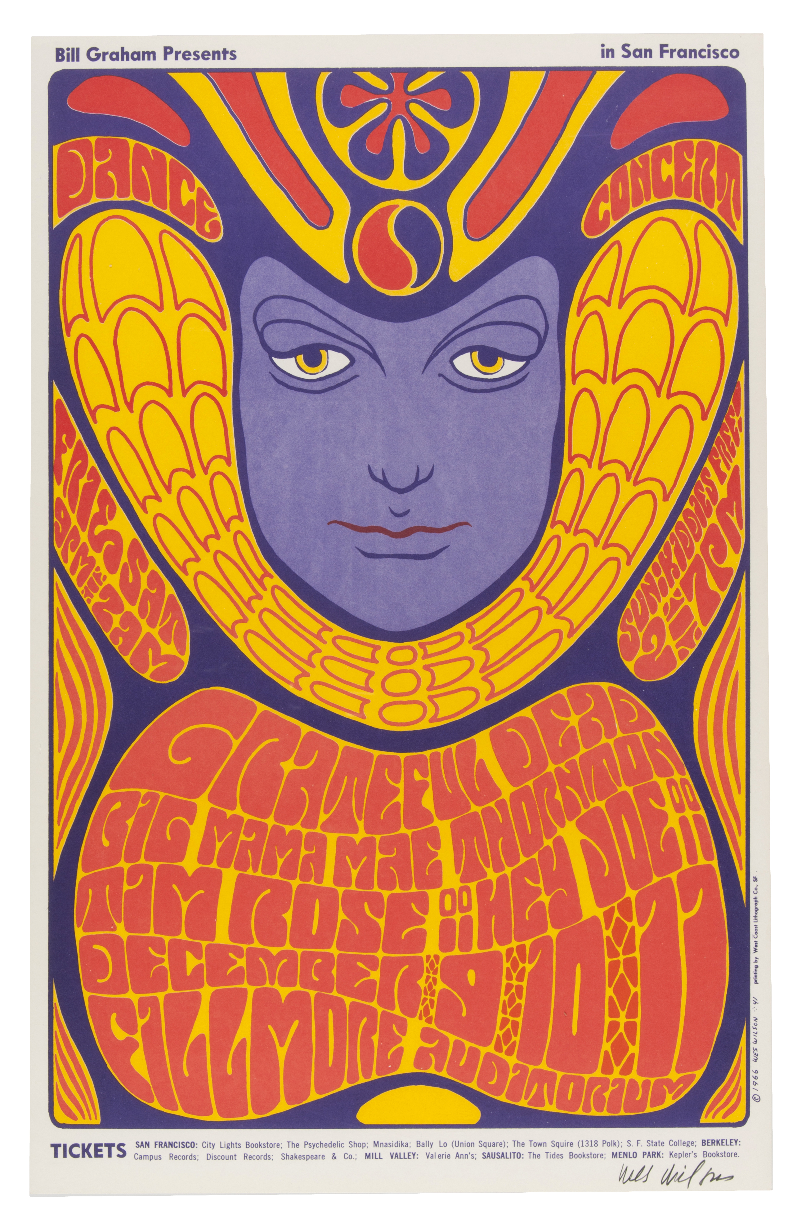
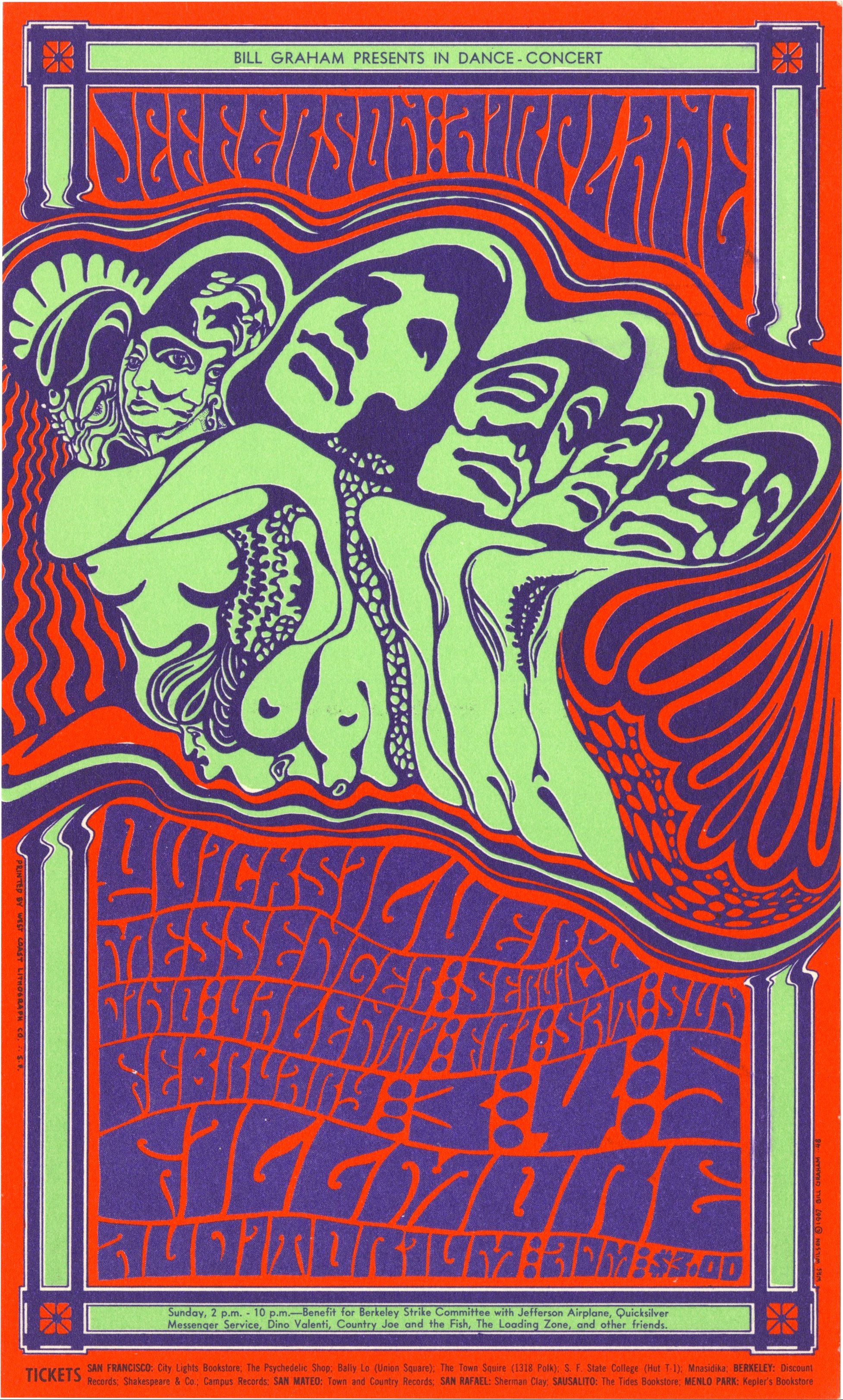
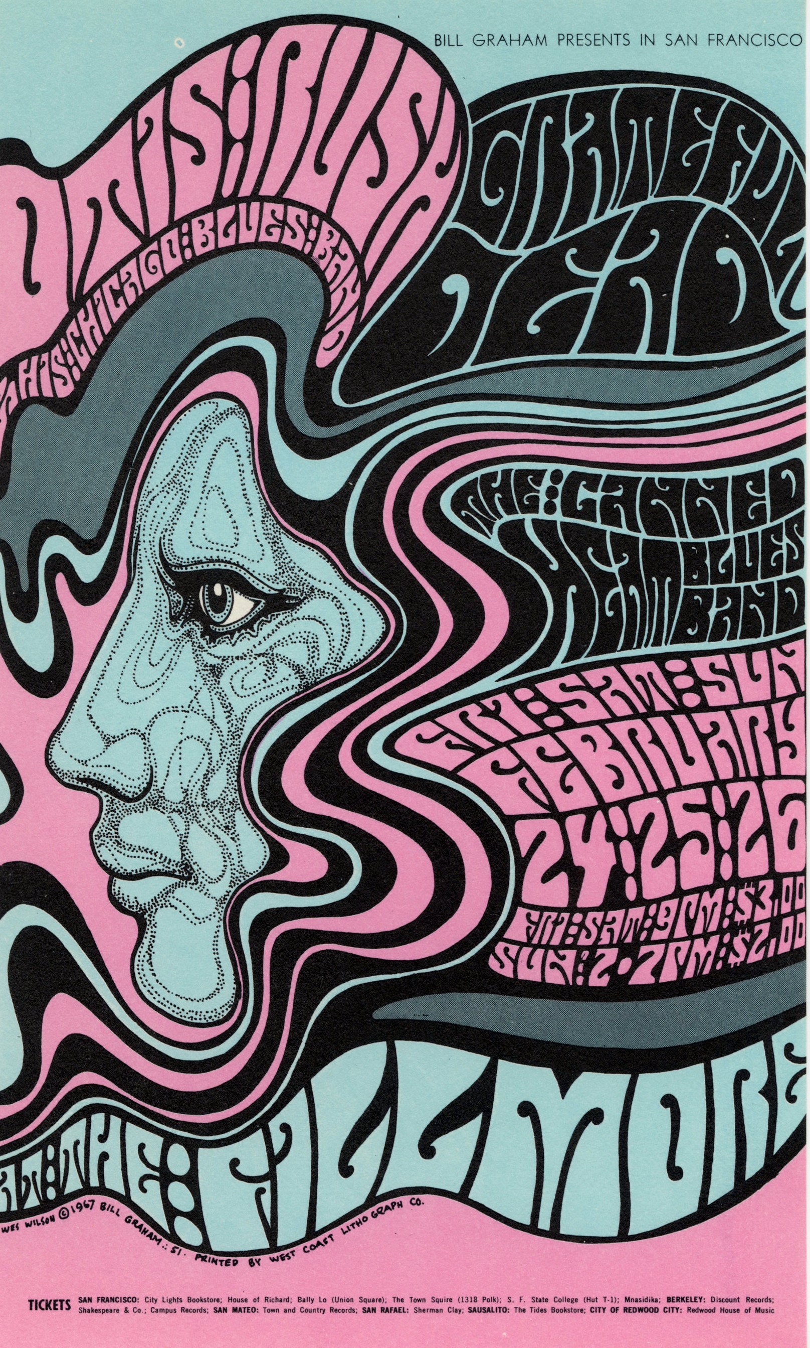
Wilson’s work is iconic precisely because it was hand-lettered, not mechanized. His letters are filled with organic curves, tightly packed counters, and warped proportions. During undergrad I often heard the phrase “Good artists copy, Great artists steal.” On the surface Pau Hana is not a direct copy of Wes Wilson’s work. Instead of imitation, I tried to adopt his frame of mind. What would Wes Wilson do if he were tasked with drawing a heavy weight for a modern type family?
In Pau Hana’s black styles I began by squeezing the counters as small as possible, pushing the outer contours into rounded, swelling curves. As the design matured, I opened the counters slightly and tempered the curves to maintain readability while keeping the exuberant spirit intact.
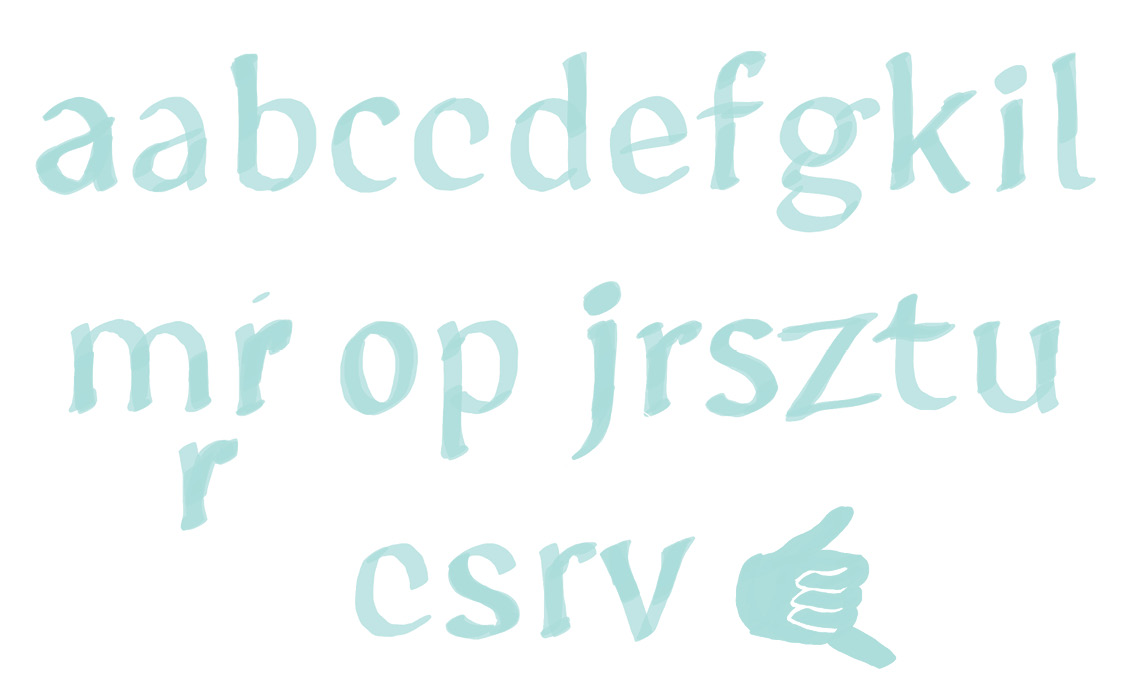
As Pau Hana developed, I found myself in the role of editor, deciding how far to push the energy and where to pull back for legibility. Counters were inflated just enough to prevent letters from collapsing at small sizes. Curves were refined so entrance and exit strokes could connect more smoothly. The heavy weight was tuned to sit in harmony with the regular.
Find the Breaking points
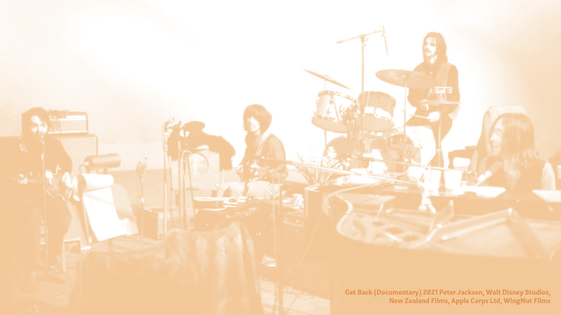
That push-and-pull process reminded me of a several moments in Get Back, the documentary about the Beatles. Much of their creative work came from testing a song in absurd variations. They would sing the song too fast, too slow, sung through gritted teeth or purposely fitting different accents or words to different melodies. Those experiments revealed each song’s breaking point. By pushing past the edge, the band learned what made each song work. Through this play they were able to experiment with the extremes of each song and find things that pushed their music into new territory when they tempered it back.
My own process with Pau Hana felt similar. I tried too much flair, then none at all. I broke letters into stencils, exaggerated them into ultra-black forms, then reeled them back. The final typeface may look tame compared to my sketches, but that restraint is the product of deliberate overreach. It’s easier to pull back from the edge than to invent energy from something too strict.
Pau Hana emerged from a mix of technical goals and cultural influences—translation contrast, Waikīkī signage, and the freeform spirit of Wes Wilson. The result is a type family that sits comfortably in body text yet carries traces of the vernacular and the creative experiments that shaped it.
Like the Beatles testing their songs, or Waikīkī evolving its own letterforms over decades, the process was one of excess, refinement, and balance. And just as vernacular signage reflects the culture of a place, Pau Hana reflects the dialogue between environment, history, and personal process that drives so much of typographic design. 🤙