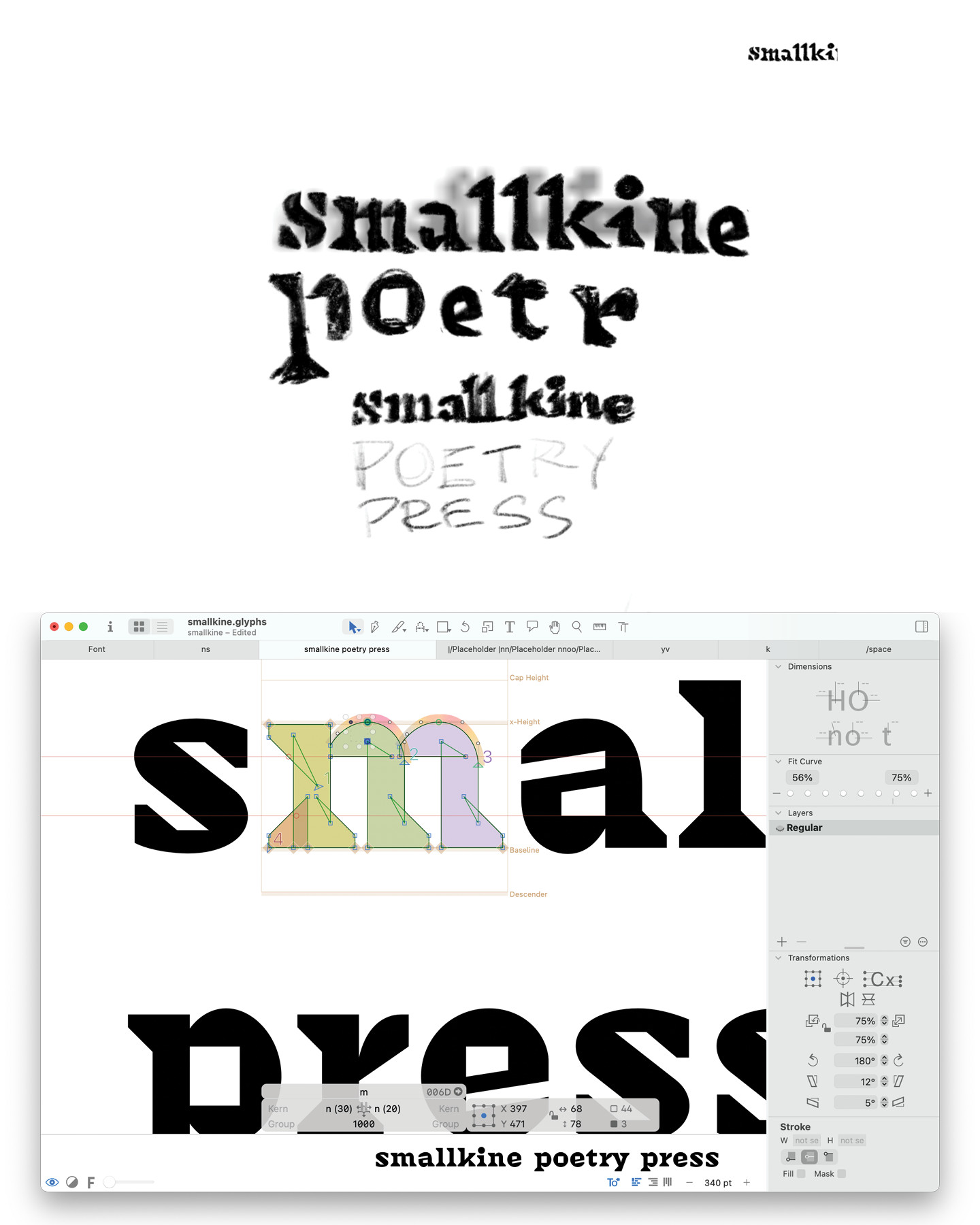
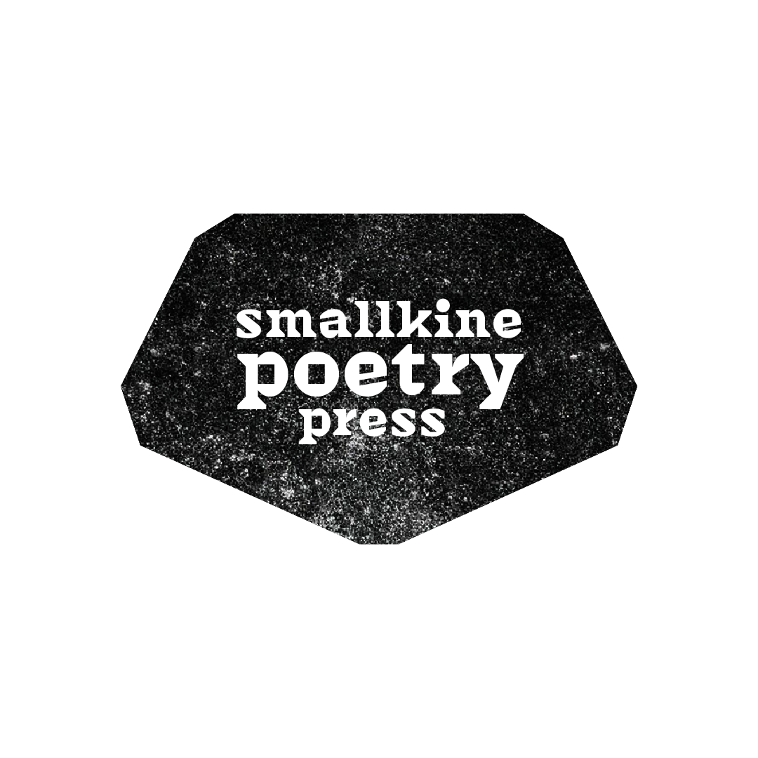
Smallkine Poetry Press is a poetry project and I'm sure a future powerhouse of poetry by Zach Payne. He wanted a logo that could act as a common thread, tying together his work and the voices of the community around him. Like traditional publisher’s marks that live on spines, title pages, or colophons, this logo needed to be small, durable, and versatile. It had to stay clear even if it appeared on the back of a zine, stamped into a page, or run off on a photocopier. In other words, it had to withstand and thrive in the wear and tear of DIY production.
As type size decreases visual adjustments to maintain legibility become more and more extreme. I first learned about this from David Sudweeks, when he was developing Pearl, a miniature typeface. As things scale down, forms exaggerate, counters inflate, letters widen. The change that most captured my attention at the time is attributed to Dwiggins’ “M-formula.” Flat lines and sharp edges when viewed from a distance can transform into delicate round curves. Dwiggins stated: "The said M-formula applies to small sizes. It is, as discussed before, a method to trick the eye (in viewing objects much reduced) into seeing curves that aren’t there." These "phantom curves" can simplify the letter shape and be leveraged to act as ink-traps reducing the weight gain of strokes.
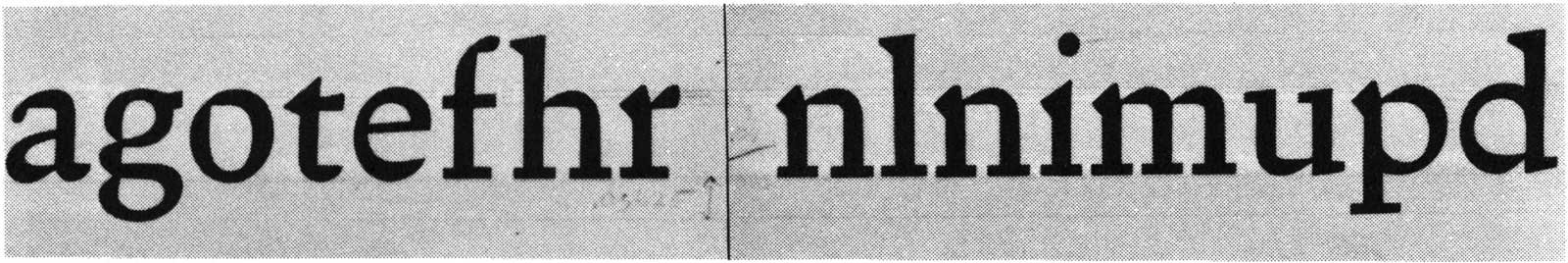
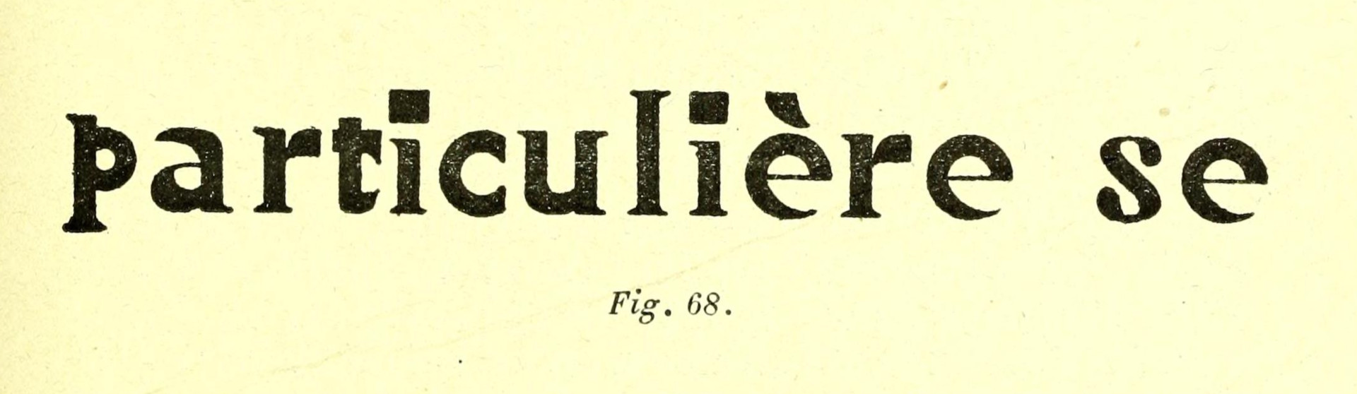
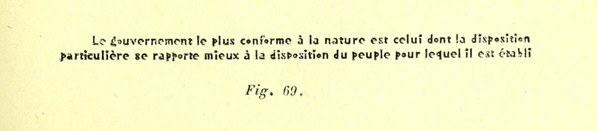
The idea resurfaced years later when I came across Émile Javal’s Physiologie de la lecture et de l’écriture. His studies of legibility show how forms that look broken or awkward at large scale can optically blend back into legibility when smaller (compare figures 68 and 71). This visual trick of distortion at one size becoming clarity at another stuck.

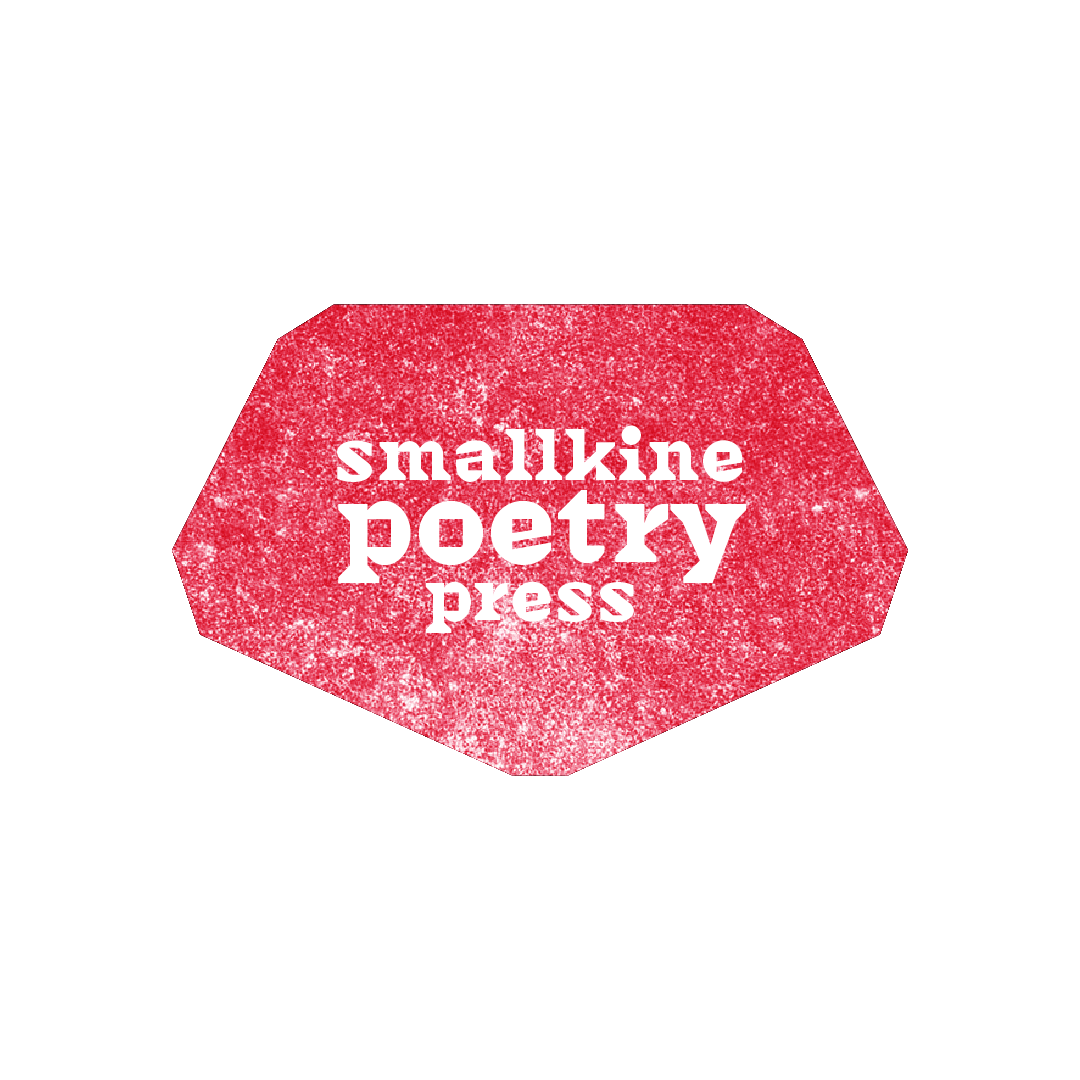
When the chance came to design the Smallkine logo, it felt like the perfect application of these ideas. The final mark leans into square counters and oversized serifs, producing a chunky letterform that holds its structure at the smallest sizes while still offering visual interest when scaled up. I hope it joins a long tradition of publisher’s marks: built to survive imperfect printing, endure, and signify the poets' voice wherever it appears.
In this way, Smallkine’s logo places the press in a lineage that stretches from early printers’ devices to today’s zine culture. Each of these traditions shared a commitment to resilience, and identity, even when resources were limited. The mark is not just a logo, it is a reminder that poetry thrives when we choose to keep it alive.