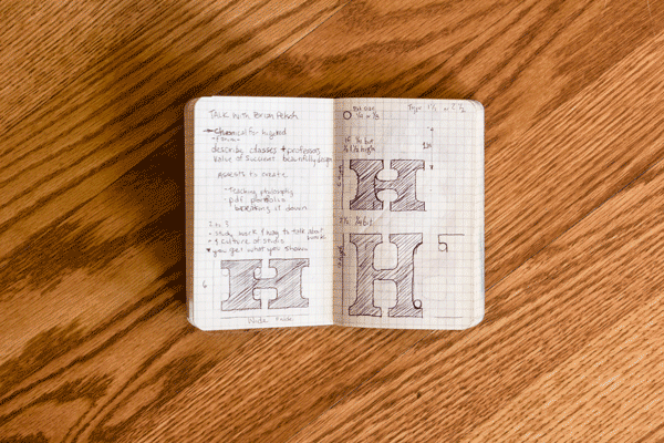
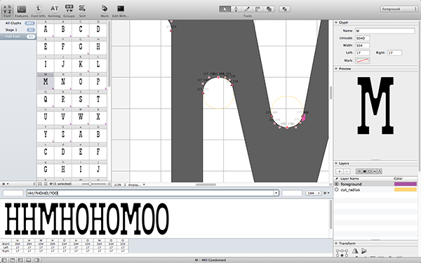
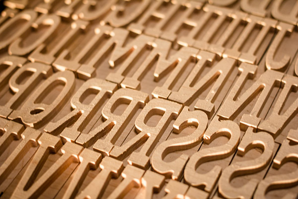
I wanted to create a typeface that sat between traditional type and contemporary media. It is styled it after classic American wood type with condensed proportions and fatter serifs. While doing the initial sketches and brainstorming for this typeface, I knew I wanted to cut the typeface using a single bit on a CNC mill. Rather than hand finish the corners with a chisel, or use a V carve bit, using a single round bit really puts the process on display. This added a couple constraints to my type. For one, all the inside corners needed the same radius. I had to do away with any sharp inside corners and bend some of the legibility and weight rules to fit to this physical constraint. I designed the typeface in Robofont so I have a working font file as well as the finished cut wood type.
Production
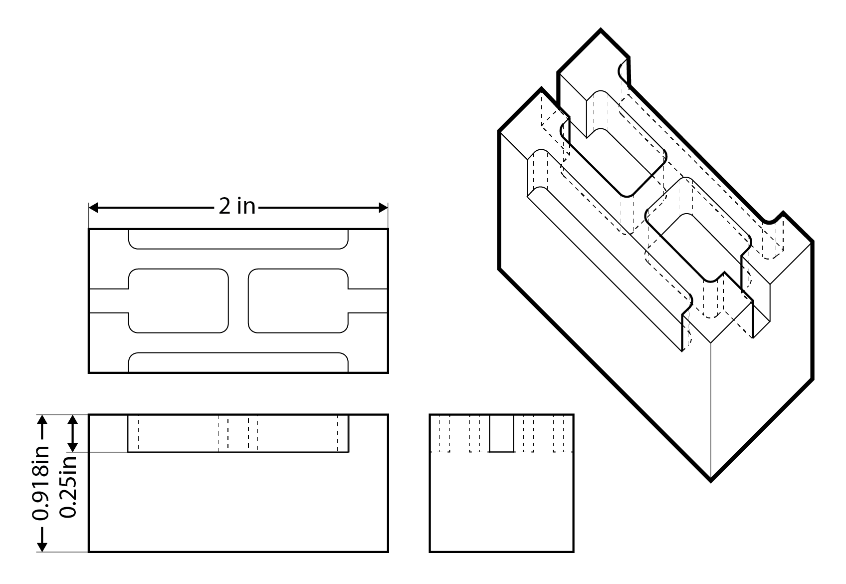
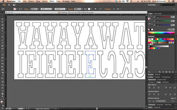
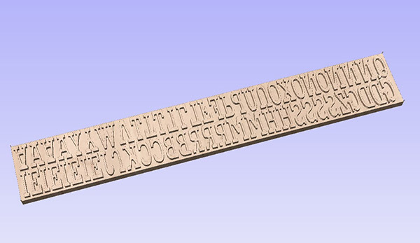
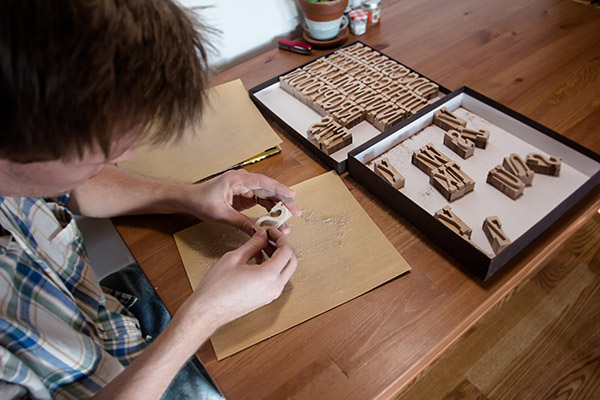
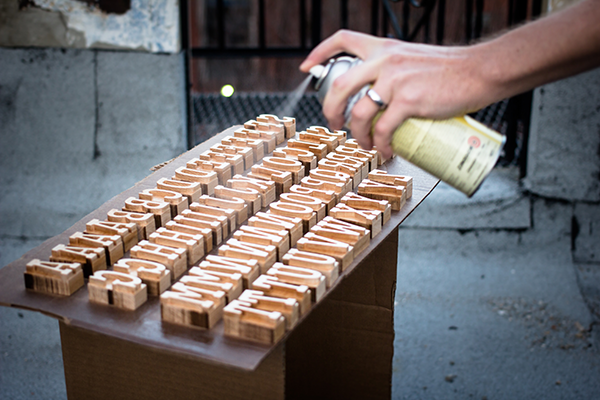
When setting up my file for cutting, I spaced everything as tight as possible to maximize the amount of letters, while still allowing the bit to pass between them. I bought the raw lumber and cut and surfaced it down to the 0.918 inches so it would match the standard height for press. After I had it machined, I took it into the wood shop and cut the letters apart on the bandsaw. After some light sanding to get rid of the burrs, my type was ready to finish with a couple coats of Bullseye Shellac and some light sanding.

Printing
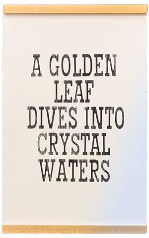
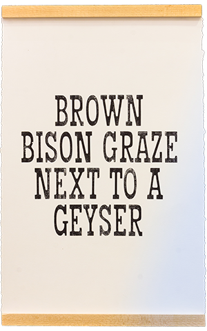
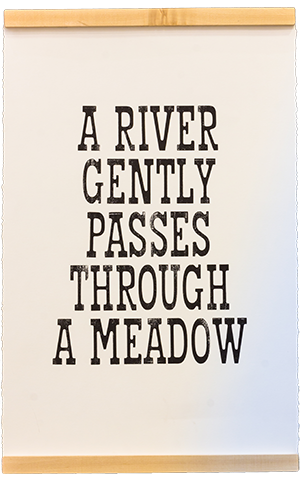
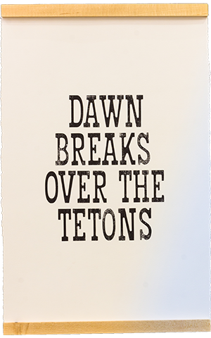
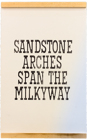
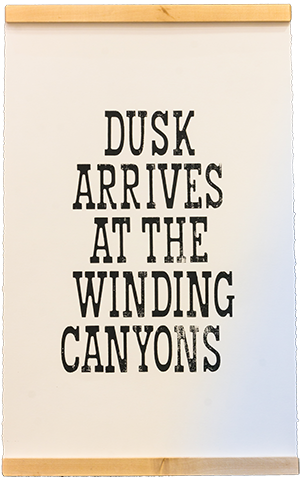
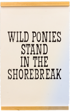
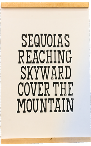
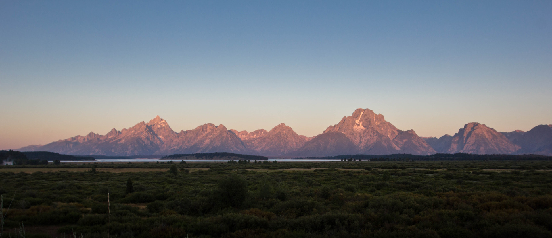
For the maiden print of Mill I wanted to print a series of posters that connected with each of the parks that I visited. I was limited to the letters that I had cut. So it became a puzzle, what was the most words I could write, that would make sense that still related to and reminded me of the time I'd spent in each park? The posters were designed to be paired with my series of screenprints you can read about below. They took on a minimal and poetic quality reminiscent of an incomplete park themed pangram.