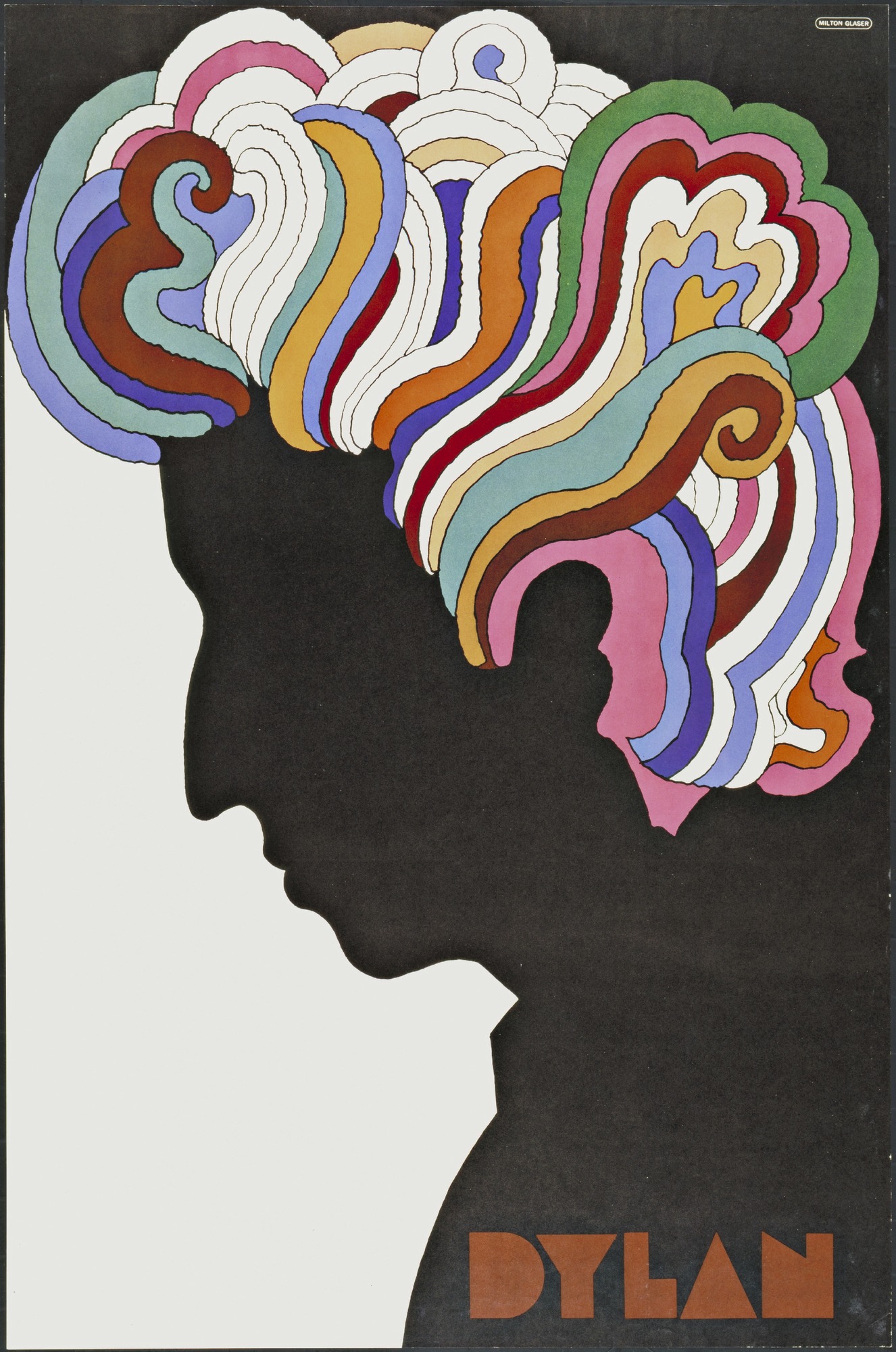
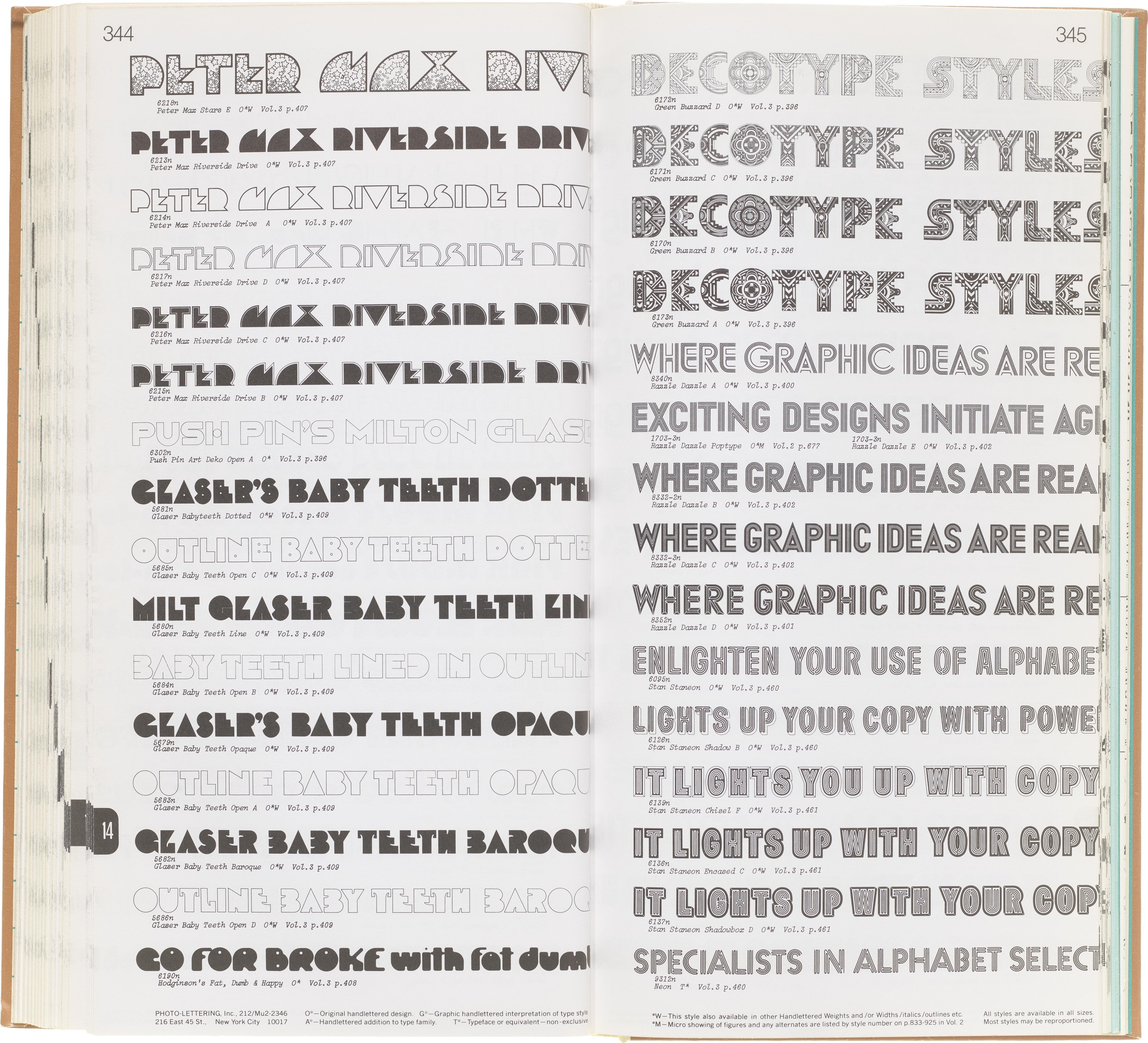
I remember walking into my graphic design classes in undergrad and seeing Milton Glaser's famous Bob Dylan poster hung up on the wall by the door. It honestly took maybe the first half of the semester before I realized it wasn’t a student project, or someone's forgotten work they never took home. This poster was Glaser's first use of a custom font he created called Babyteeth.
He drew inspiration from a hand painted sign he found in Mexico. He said “The inspiration for my Babyteeth typeface came from this sign I photographed in Mexico City. It’s an advertisement for a tailor. The E was drawn as only someone unfamiliar with the alphabet could have conceived. Yet it is completely legible. I tried to invent the rest of the alphabet consistent with this model.”
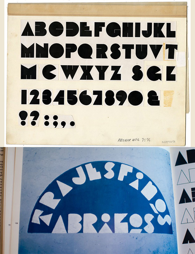
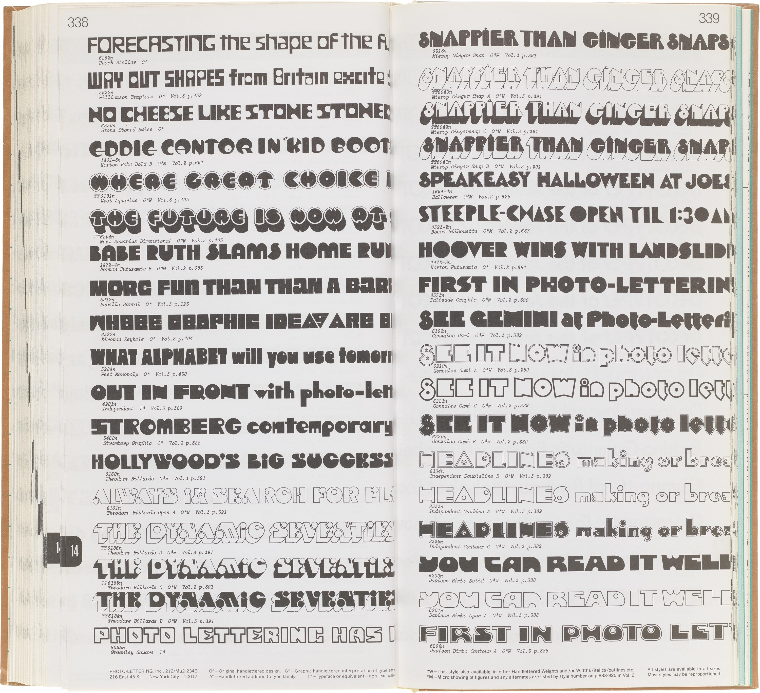
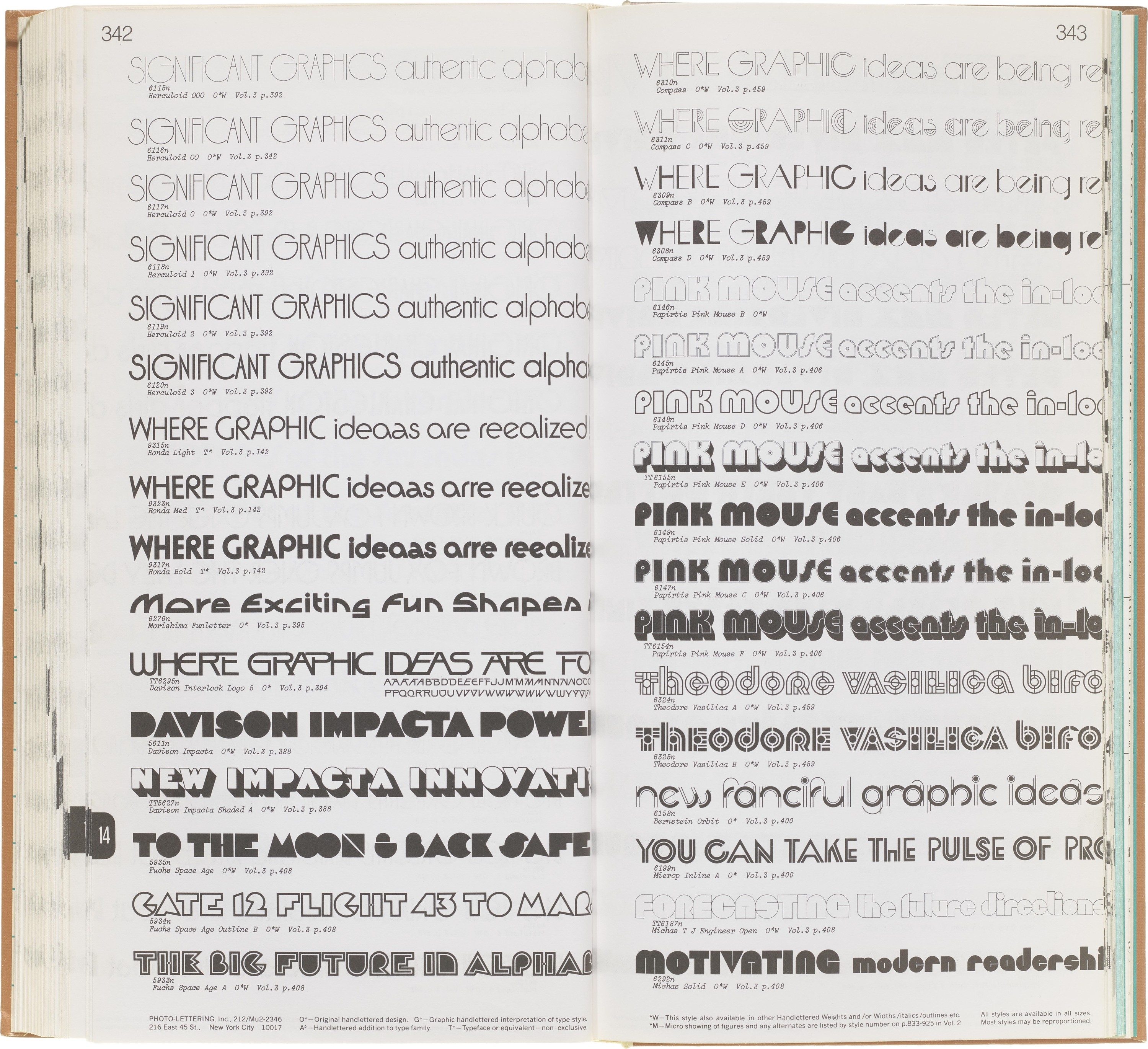
While Babyteeth is probably the most well known version of this style, it was not the first and definitely not the only iteration of this blocky, counterless typographic style. As I was looking through Photo-Lettering's One Line Manual of Styles I found a handful of styles that all play with this same idea.
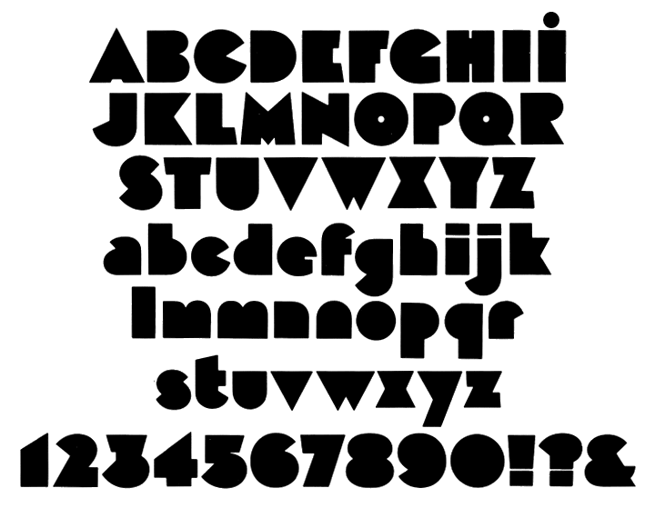
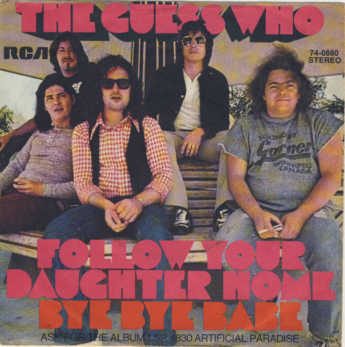
Some of my personal favorites from the era are Black Boton, designed by Albert Boton in 1970 and used on the album cover for The Guess Who. Another is the outline shadow style Sunshine designed for Letraset in 1971.
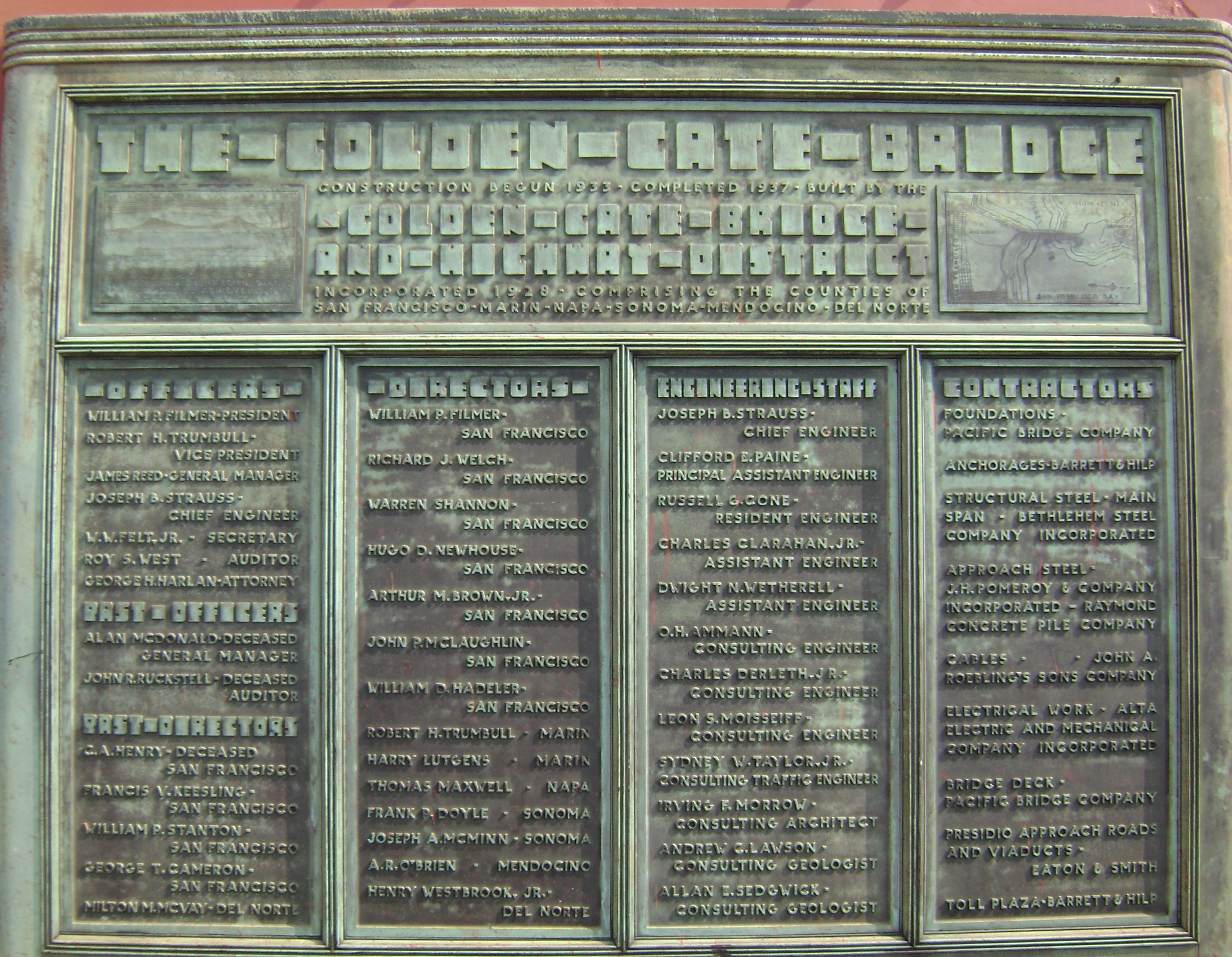
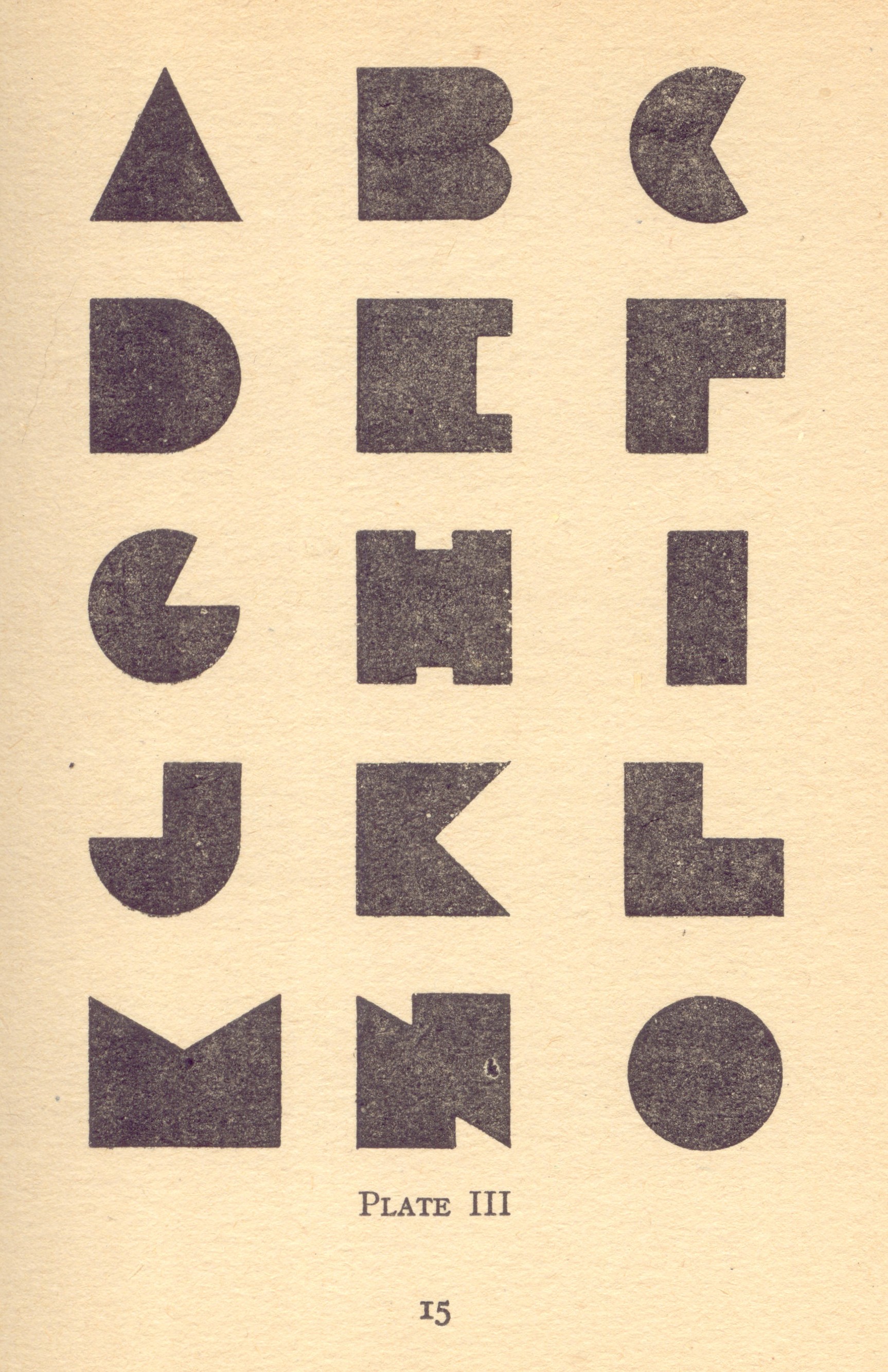
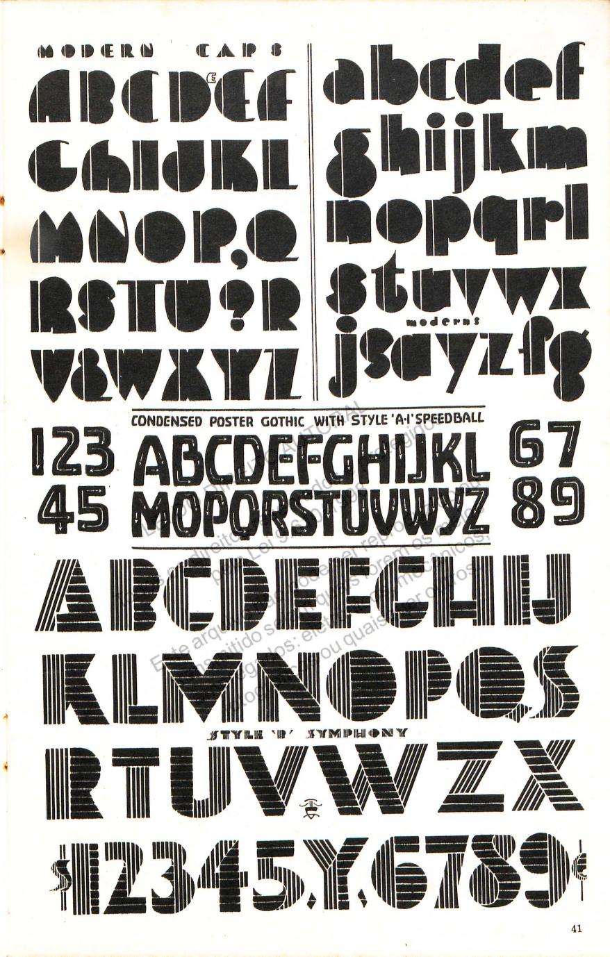
Seeing so many examples and styles I started to hunt for the OG, or root of the style. I remember stumbling into this plaque for the Golden Gate Bridge years ago. While not the same the blocky almost. Invisible counters could definitely be a cousin in terms of concept. The bridge was finished 1937. In a few lettering manuals, also from the 1930’s, I found these two examples.The first “Modern Lettering” the second example titled “Modern Caps” from the Speedball textbook.
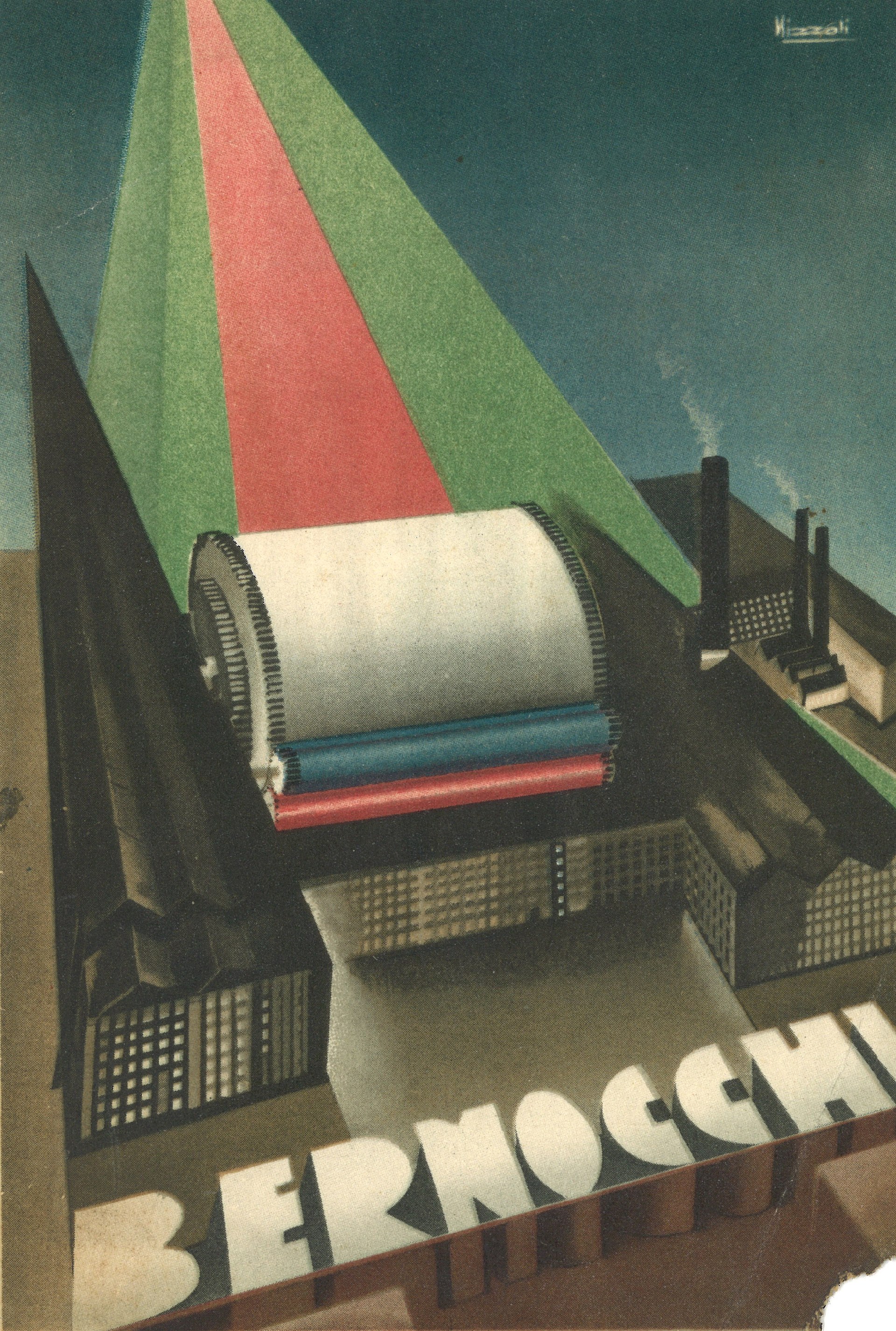
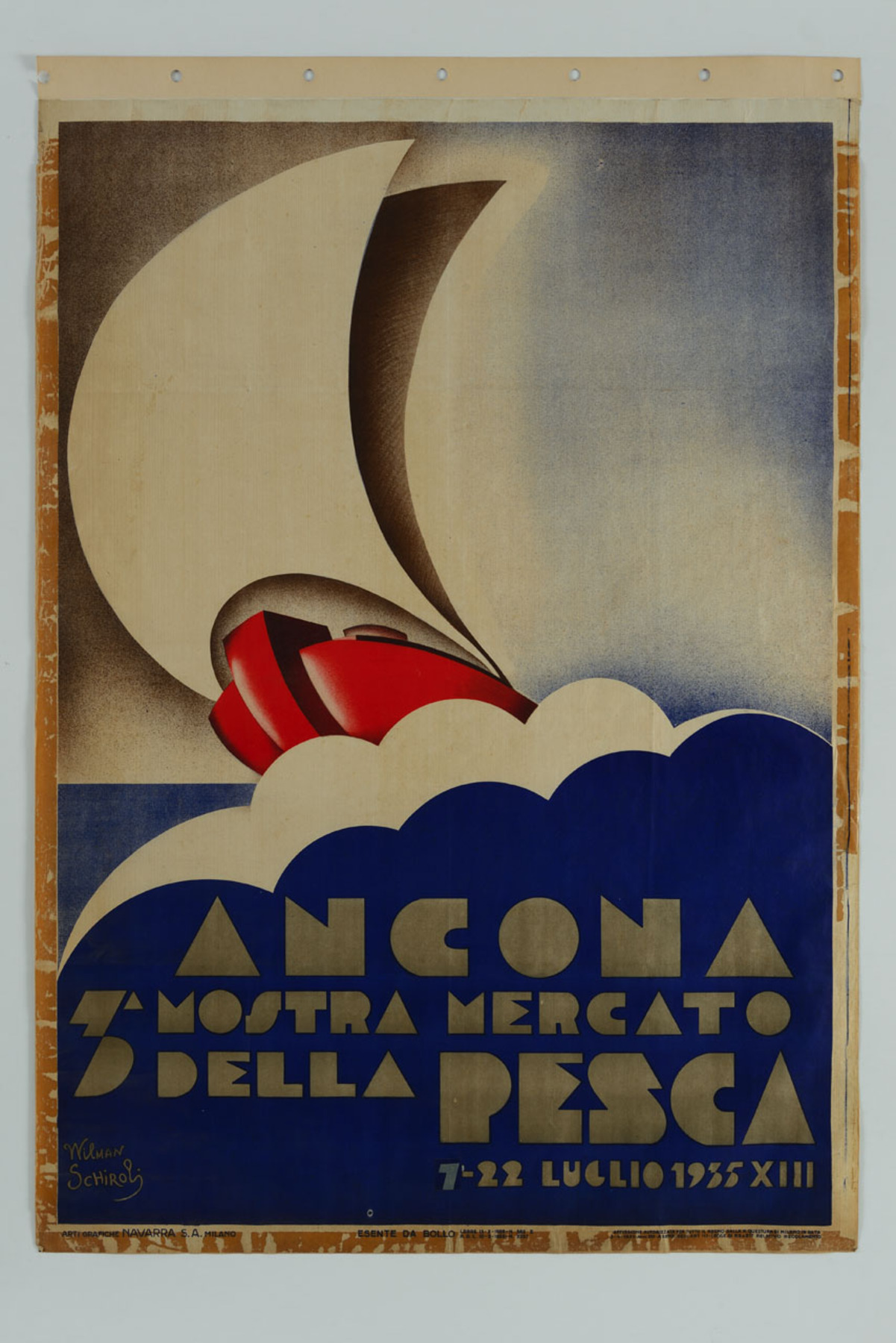
Following the thread back further I found references to this "Modern" style coming from a few Italian poster designers Wilman Schiroli 1935 and Marcello Nizzoli from the early 1920's.
Around this point my trail back started to go cold. But it makes sense thinking about the evolution of a typographic style. You test it out in a one-off small use case. Some lettering, a poster, a limited characterset. The style catches on in the community, makes its way into lettering textbooks and letter models. If it becomes a staple, it makes the switch to a typeface, or in this case several variations all encapsulated in letrasets specimen. With the advent of a new technology it’s only a matter of time before it is adapted again.
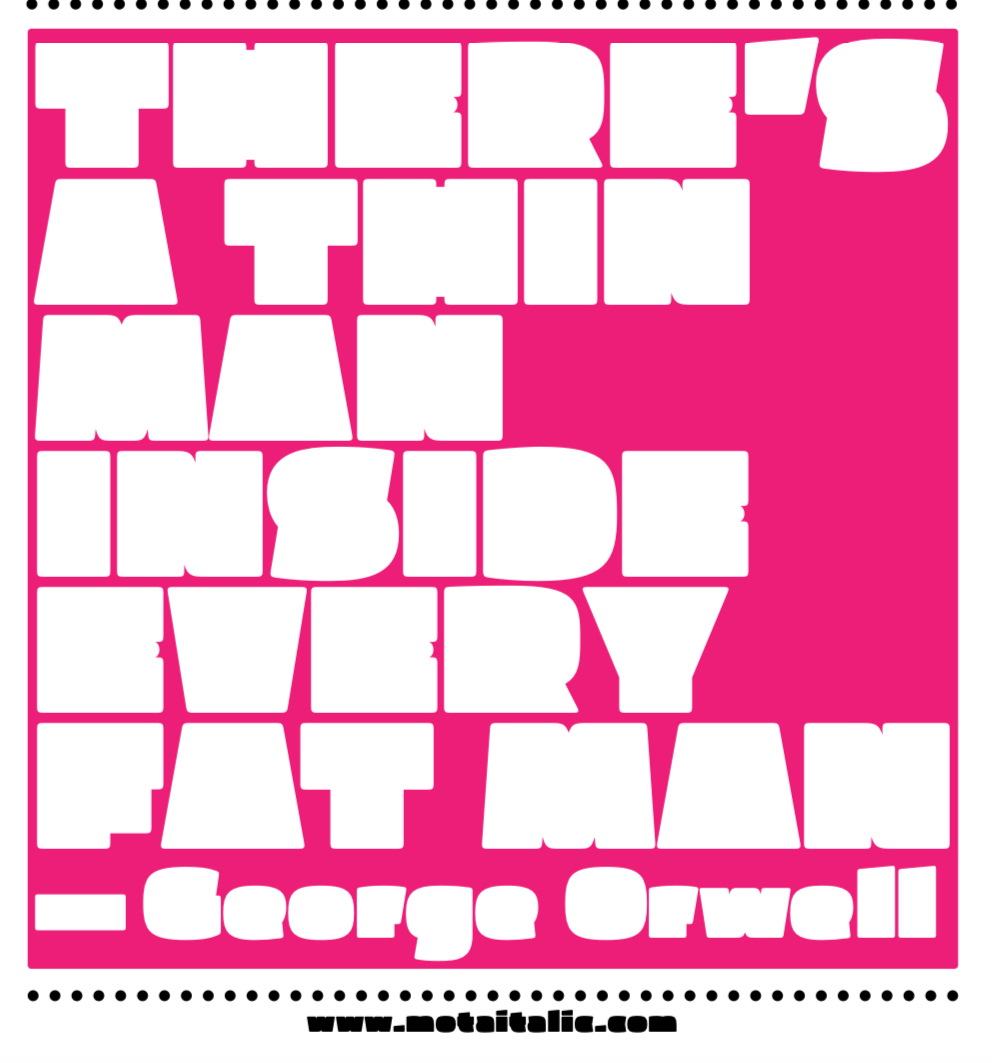
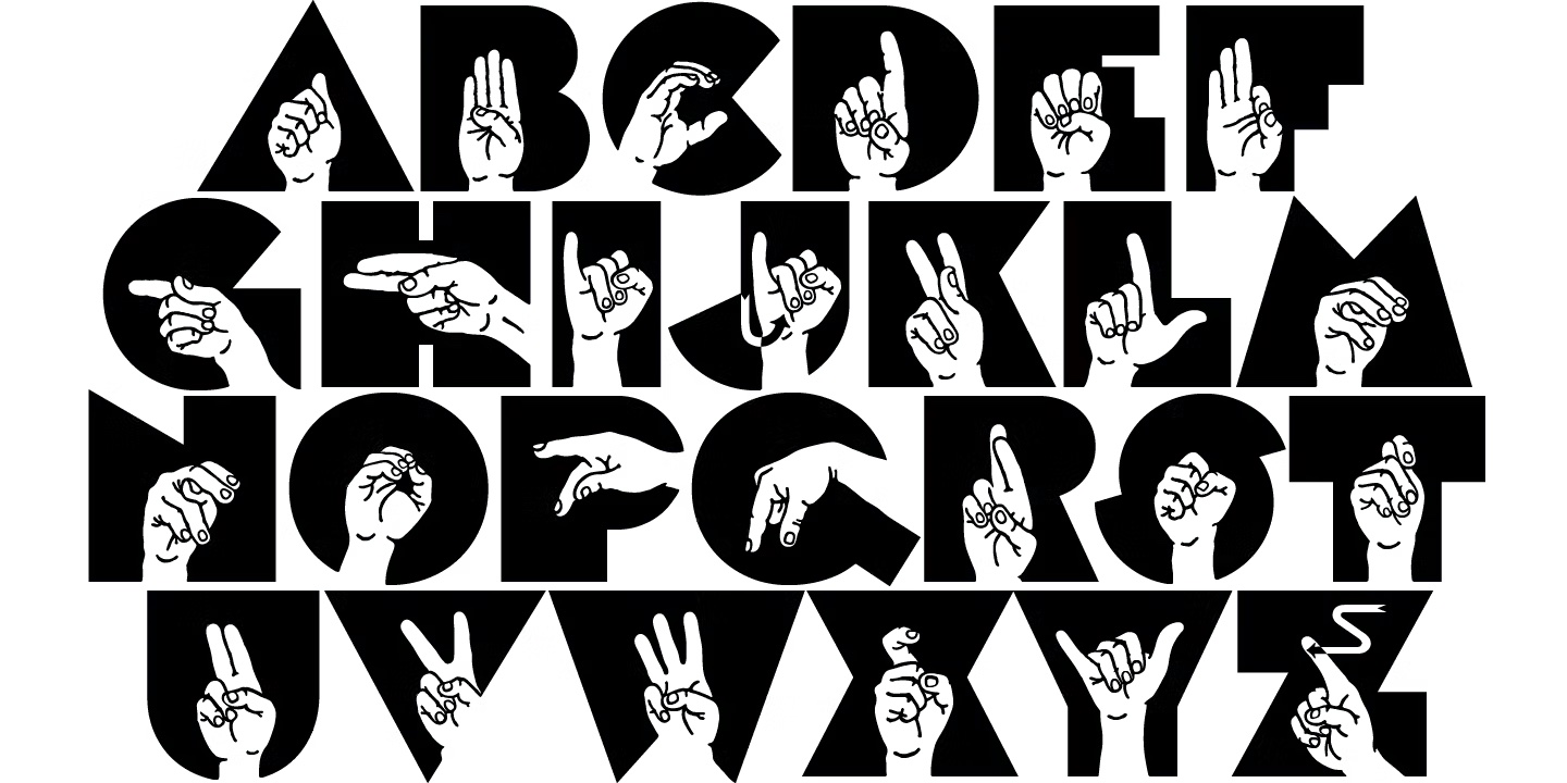
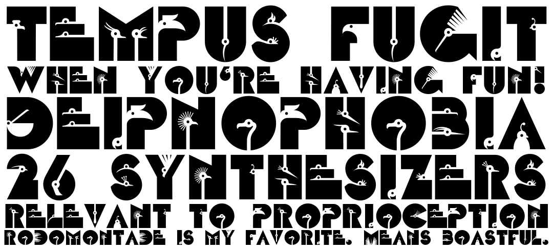
With the switch to digital type, it's no surprise to see this style adapted, and evolved. Some are more strict adaptions, like P22's authorized release of Milton Glaser's Babyteeth. Others I would label as spiritual successors, like Pufff by Motia Italic. Some of my favorite variations I have found use the vast black blocks of space as a canvas for their own combination of imagery, creating a fun blend of letters and illustration. Fingerspeller by John Bomparte or zootype published by linotype are two good examples.
The more I get into type, its history and roots, the more I see the cyclical nature of it. This style was “played out” by the 1960’s but that didn’t stop Milton Glaser. It didn’t stop any of of the recent iterations, and I’m sure there will continue to be explorations in the style for the foreseeable future. Evolution in type isn’t so much leaps and bounds, but a slow retreading and retooling as styles slowly evolve and develop to meet the needs of each new iteration. 🤙